Warm (True) Spring is the warmest season of the Spring family (Light Spring, True/Warm Spring and Bright Spring) and it sits between Light Spring and Bright Spring on the seasonal flow chart. Unlike Light Spring and Bright Spring, which have neutral warm leaning undertones, Warm (True) Spring is completely warm.
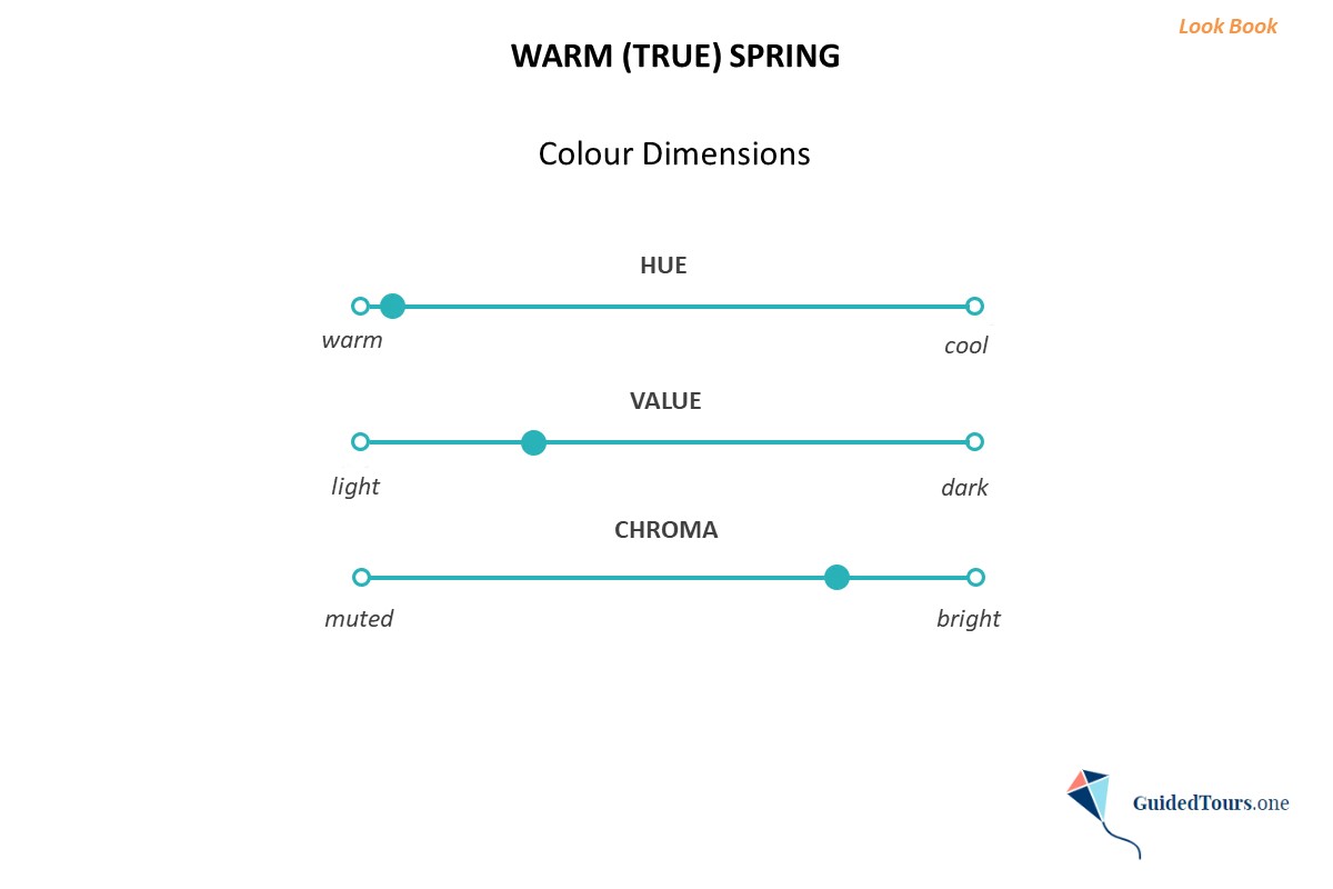
If we examine the Colour Dimensions of Warm (True) Spring (image 2) we can see that it is first of all warm, and then it is bright and after that light.
Hue: Warm (Warm Spring is the warmest season of the Spring family, and this is the main colour aspect of this season type).
Value: Medium-light (Warm Spring colours can be lighter or darker, but overall the value is medium-light, leaning slightly to the middle of the value scale). more
Chroma: Medium-bright (Warm Spring has a medium-bright chroma, and it falls about in the middle on the bright left side of the scale).
Now, let’s examine the features (hair, skin tone, eyes) of Warm Spring representatives.
Hair: Warm Spring hair can be medium golden blonde, strawberry blonde, copper, light golden brown, and medium golden brown. The hair has golden undertones to give us that warm feeling.
Skin tone: Warm Spring skin has a big range of skin tones, ranging from fair to tan and can be fair, light, medium, or tan. The skin has clear warm undertones.
Eye Colours: Warm Spring eyes are warm and come in a variety of colours. They are generally warm blue, warm green, light hazel, orangey-brown topaz or light brown, and can have both a halo and speckles within the iris.
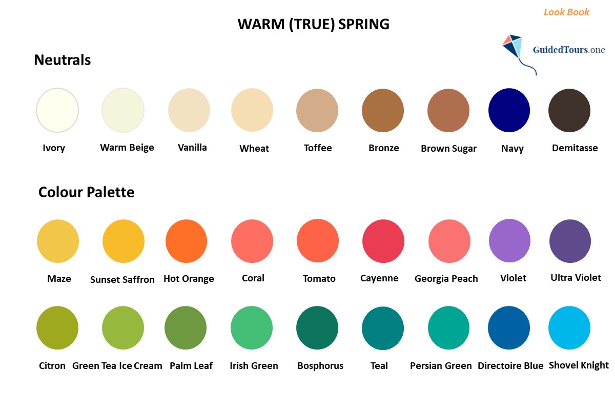
Colour Palette
Just like Warm Spring’s primary colour dimensions, Warm (True) Spring colours are warm, medium-bright, and medium-light to be in line with this season type natural colouring.
The overall Warm Spring Colour Palette (image 1) contains some of the warmest colours of the spring family. The colours are mainly medium-light, but there are many colours that are lighter or darker. There is not a hint of coolness in this palette.
The colours are at the warm end of the scale, so they are extremely warm with a clear yellow undertone. The colour palette includes many warm greens, yellows, orangey reds, and peachy pinks, but fewer tints and shades of blue, which is the coolest colour of all. The blues that you will find in the palette have a tint of yellow to make them warmer.
At the same time, there are many neutrals in the Warm Spring palette, including ivory, warm beige, bronze, and navy. Warm Spring neutrals include light neutrals, as well as dark ones. This mixture in value is needed to achieve a medium-low value contrast, as the contrast between this season type features (you will find more details about this in the next section). Black and white are not included in the palette, but Warm Springs have their own “version” of black and white in the palette, most often ivory and demitasse.
Warm Spring worst colours are cool and soft, because they are opposed to warm and bright, the main colour aspects of this season type.
If we examine the Colour Dimensions of Warm (True) Spring (image 2) we can see that it is first of all warm, and then it is bright and after that light.
Hue: Warm (Warm Spring is the warmest season of the Spring family, and this is the main colour aspect of this season type).
Value: Medium-light (Warm Spring colours can be lighter or darker, but overall the value is medium-light, leaning slightly to the middle of the value scale). more
Chroma: Medium-bright (Warm Spring has a medium-bright chroma, and it falls about in the middle on the bright left side of the scale).
Now, let’s examine the features (hair, skin tone, eyes) of Warm Spring representatives.
Hair: Warm Spring hair can be medium golden blonde, strawberry blonde, copper, light golden brown, and medium golden brown. The hair has golden undertones to give us that warm feeling.
Skin tone: Warm Spring skin has a big range of skin tones, ranging from fair to tan and can be fair, light, medium, or tan. The skin has clear warm undertones.
Eye Colours: Warm Spring eyes are warm and come in a variety of colours. They are generally warm blue, warm green, light hazel, orangey-brown topaz or light brown, and can have both a halo and speckles within the iris.
Colour Palette
Just like Warm Spring’s primary colour dimensions, Warm (True) Spring colours are warm, medium-bright, and medium-light to be in line with this season type natural colouring.
The overall Warm Spring Colour Palette (image 1) contains some of the warmest colours of the spring family. The colours are mainly medium-light, but there are many colours that are lighter or darker. There is not a hint of coolness in this palette.
The colours are at the warm end of the scale, so they are extremely warm with a clear yellow undertone. The colour palette includes many warm greens, yellows, orangey reds, and peachy pinks, but fewer tints and shades of blue, which is the coolest colour of all. The blues that you will find in the palette have a tint of yellow to make them warmer.
At the same time, there are many neutrals in the Warm Spring palette, including ivory, warm beige, bronze, and navy. Warm Spring neutrals include light neutrals, as well as dark ones. This mixture in value is needed to achieve a medium-low value contrast, as the contrast between this season type features (you will find more details about this in the next section). Black and white are not included in the palette, but Warm Springs have their own “version” of black and white in the palette, most often ivory and demitasse.
Warm Spring worst colours are cool and soft, because they are opposed to warm and bright, the main colour aspects of this season type.
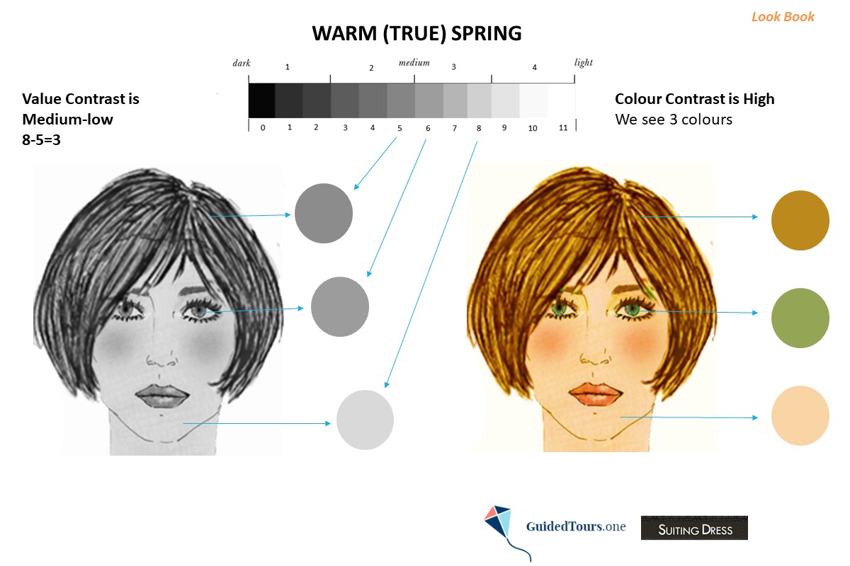
Value Contrast
The value (or depth) shows how light or dark a colour is, while the value contrast is the level of difference in value between two or more colours. The closer together colours are, the lower is the level of contrast between them, and the farther apart colours are, the higher is the level of contrast.
Regardless of the values of Warm/True Spring representatives features, there is usually a medium-low value contrast between them.
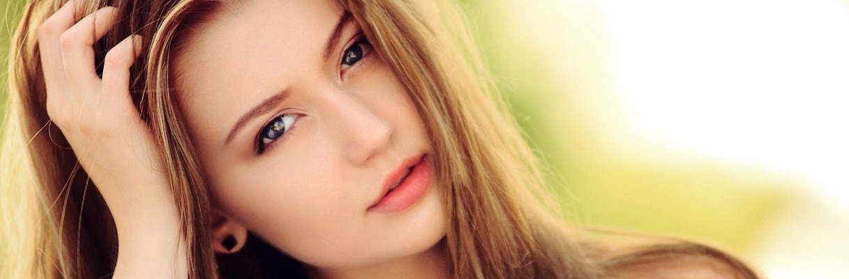
On the image on your right, you can see a Warm Spring representative with medium-light eyes and skin and medium-dark hair. In order to determine her value contrast level, we converted her photo into greyscale and assigned a value from 0 to 11 to her hair, skin, and eyes (5 to her hair, more
The value (or depth) shows how light or dark a colour is, while the value contrast is the level of difference in value between two or more colours. The closer together colours are, the lower is the level of contrast between them, and the farther apart colours are, the higher is the level of contrast.
Regardless of the values of Warm/True Spring representatives features, there is usually a medium-low value contrast between them.
On the image on your right, you can see a Warm Spring representative with medium-light eyes and skin and medium-dark hair. In order to determine her value contrast level, we converted her photo into greyscale and assigned a value from 0 to 11 to her hair, skin, and eyes (5 to her hair, more
8 to her skin, and 6 to her eyes). Next, we took the highest number and took away the lowest number (8-5=3). According to our value contrast scale that you can see below, she has a medium-low value contrast.
A) 0 - 2 (low value contrast)
B) 3 - 5 (medium-low value contrast)
C) 6 - 8 (medium-high value contrast)
D) 9 - 11 (high value contrast)
The medium-low value contrast, shows us that she can wear colours that provide a medium-low value contrast and her clothes should not be more than 3 values apart.
Following this example, you can examine your own features and see if there is a medium-low value contrast between them. Warm Springs typically have a medium-low value contrast between their features.
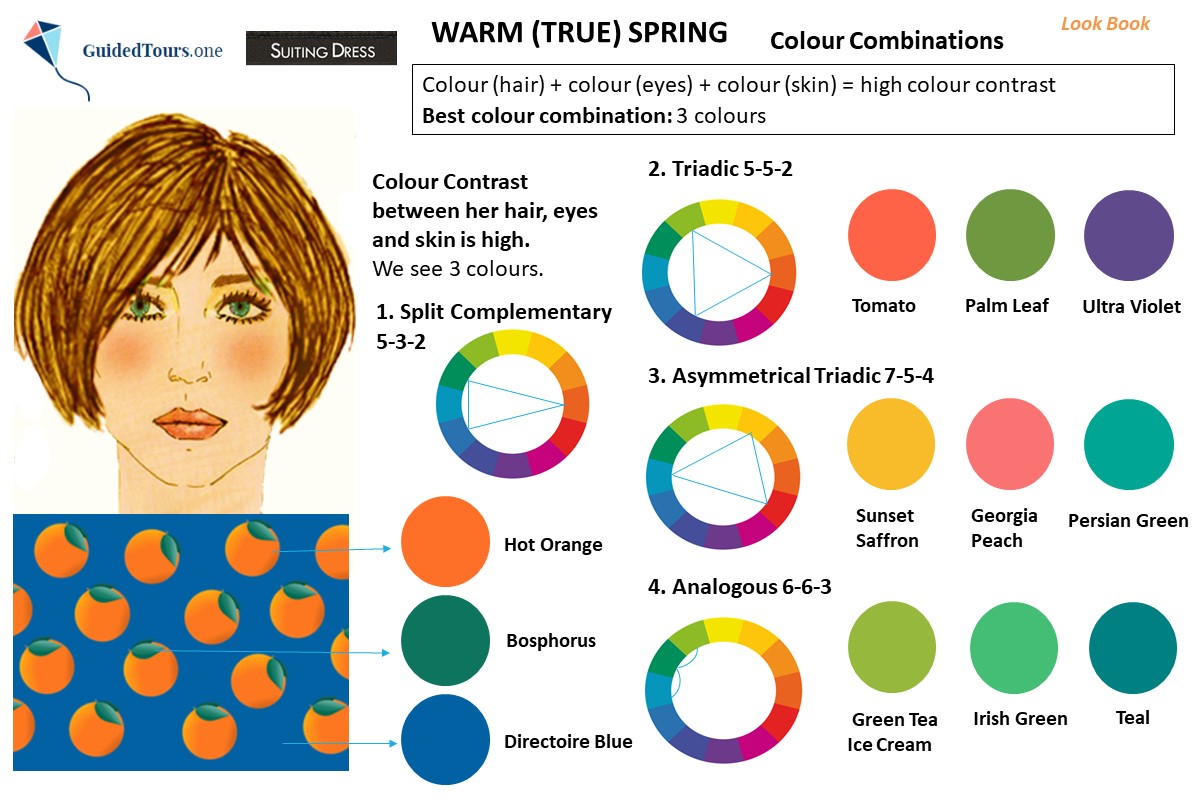
Colour Contrast
In terms of colour contrast, Warm/True Springs typically have a medium-low colour contrast, when two of their features are neutral and one feature has a colour in it, a medium-high colour contrast, when one of their features is neutral, and two features have a colour in them or a high colour contrast, when all their features have a colour in them.
On the image on your right, you can see that the Colour Contrast of the same Warm Spring representative selected by us is high, as we can see 3 colours in her features: golden blonde hair, warm green eyes and warm pink skin. The best colour combination will be: 3 colours.
Following this example, you can examine your own features and see if there is a medium-low colour contrast, a medium-high colour contrast or a high colour contrast between them. Warm Springs typically have a medium-low colour contrast, a medium-high colour contrast or a high colour contrast between their features.
A) 0 - 2 (low value contrast)
B) 3 - 5 (medium-low value contrast)
C) 6 - 8 (medium-high value contrast)
D) 9 - 11 (high value contrast)
The medium-low value contrast, shows us that she can wear colours that provide a medium-low value contrast and her clothes should not be more than 3 values apart.
Following this example, you can examine your own features and see if there is a medium-low value contrast between them. Warm Springs typically have a medium-low value contrast between their features.
Colour Contrast
In terms of colour contrast, Warm/True Springs typically have a medium-low colour contrast, when two of their features are neutral and one feature has a colour in it, a medium-high colour contrast, when one of their features is neutral, and two features have a colour in them or a high colour contrast, when all their features have a colour in them.
On the image on your right, you can see that the Colour Contrast of the same Warm Spring representative selected by us is high, as we can see 3 colours in her features: golden blonde hair, warm green eyes and warm pink skin. The best colour combination will be: 3 colours.
Following this example, you can examine your own features and see if there is a medium-low colour contrast, a medium-high colour contrast or a high colour contrast between them. Warm Springs typically have a medium-low colour contrast, a medium-high colour contrast or a high colour contrast between their features.
As seen in the previous section, the value contrast between Warm (True) Spring features is medium-low, while the colour contrast is medium-low, medium-high or high.
In terms of colour, the best colour combination for Warm Springs with two neutral features and one feature that has a colour in it will be 2 neutrals and 1 colour, while the best colour combination for Warm Springs with one neutral feature and two features that have a colour in them will be 2 colours and 1 neutral. The best colour combination for Warm Spring with 3 features that have a colour in them will be 3 colours. more
This colour combination system was created by us and supposes 4 colour combination possibilities based on each season features colour.
The best colour combinations for Warm Spring representatives (image 1), who have a high colour contrast, are the following:
1. A split-complementary colour scheme, which uses one base colour and the two colours that are adjacent to its direct complement on the colour wheel (3 colours).
2. A triadic colour scheme, which consists of three colours that are equidistant on the colour wheel (3 colours).
3. An asymmetrical triadic colour scheme, which consists of three colours that are not equidistant on the colour wheel (3 colours).
4. An analogous colour scheme, which consist of three colours that are adjacent to each other on the colour wheel (3 colours).
All colour combinations that you can see on the image include the colours from the Warm Spring Colour Palette rather than the exact corresponding colour that can be found using the colour calculator. As our Warm Spring representative has a medium-low value contrast, all colour combinations were chosen to create the same value contrast and they are only 3 values apart.
In terms of prints, the best patterns are those that only contain Warm Spring colours, but if you can’t find a print that is completely within your palette, you can opt for a print that also has small colour spots from a disharmonious palette. The best prints for Warm Spring are those that reflect the medium-low natural contrast level rather than ones which are too bold. The abstract patterns with natural elements such as feathers, birds, flowers, fruits and leaves are great for Warm Springs. The pattern should include elements that are loosely arranged and not too small or too dense. At the same time, rounded shaped geometric patterns with loose arrangement are also fine. Any very big or very small square geometric shapes should be avoided, because they don’t go well with your appearance.
On the image on your right, you can see a rounded shaped geometric pattern with loosely arranged elements (oranges) that contains 3 colours: hot orange, bosphorus and directoire blue (a split complementary colour scheme). Besides the appropriate high colour contrast, there is also a medium-low value contrast in this print. If we convert the print into greyscale, we can see that hot orange colour’s value is 5, but directoire blue colour’s value is 2. If we take the highest number (5) and take away the lowest number (2) from this print we get 3 (5-2=3), which is also the natural value contrast number of this Warm Spring representative. As both value and colour contrast are respected, you can notice how harmonious the print looks on the Warm Spring representative chosen by us.
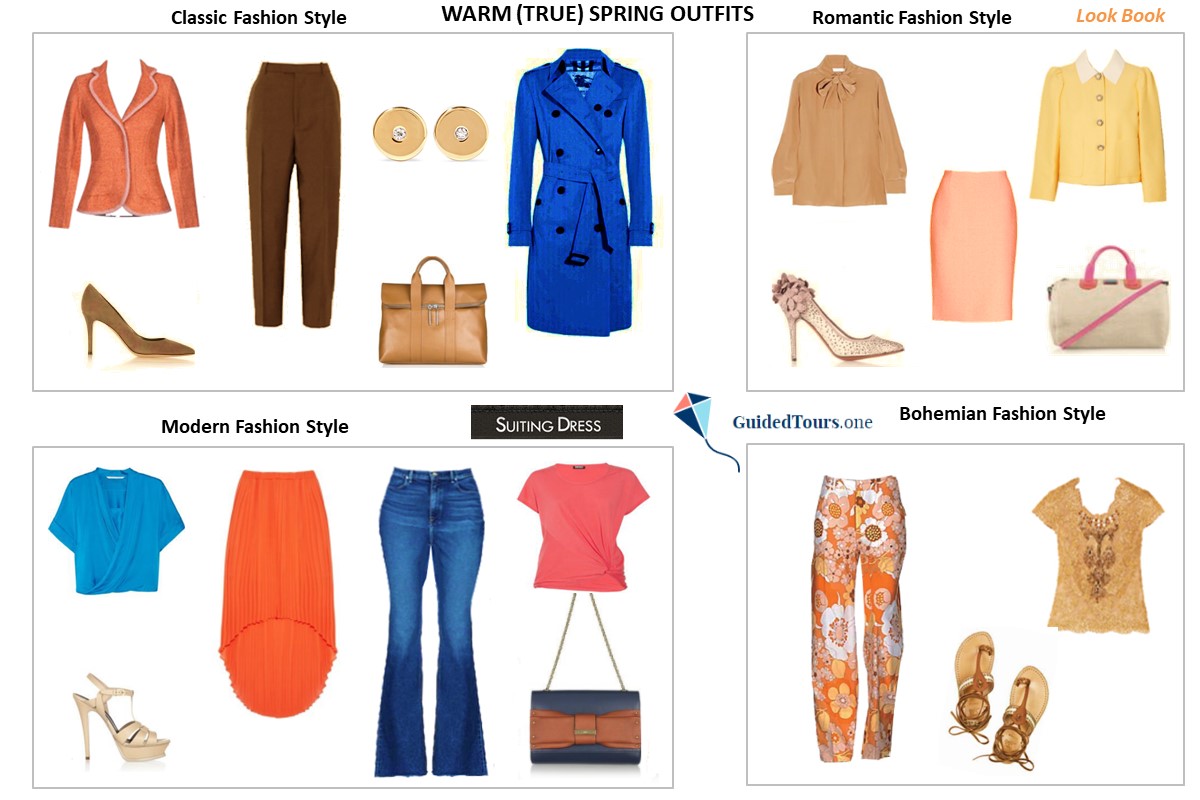
Warm Springs have a gentle palette with many options for various styles. On the image on your right (image 2), you can see some Warm (True) Spring Colour Palette Outfits ideas belonging to classic, romantic, modern and bohemian fashion styles. You can experiment with the colours in your palette to create a medium-low value contrast, and find the style that works better for you (or combine styles).
The best colour combinations for Warm Spring representatives (image 1), who have a high colour contrast, are the following:
1. A split-complementary colour scheme, which uses one base colour and the two colours that are adjacent to its direct complement on the colour wheel (3 colours).
2. A triadic colour scheme, which consists of three colours that are equidistant on the colour wheel (3 colours).
3. An asymmetrical triadic colour scheme, which consists of three colours that are not equidistant on the colour wheel (3 colours).
4. An analogous colour scheme, which consist of three colours that are adjacent to each other on the colour wheel (3 colours).
All colour combinations that you can see on the image include the colours from the Warm Spring Colour Palette rather than the exact corresponding colour that can be found using the colour calculator. As our Warm Spring representative has a medium-low value contrast, all colour combinations were chosen to create the same value contrast and they are only 3 values apart.
In terms of prints, the best patterns are those that only contain Warm Spring colours, but if you can’t find a print that is completely within your palette, you can opt for a print that also has small colour spots from a disharmonious palette. The best prints for Warm Spring are those that reflect the medium-low natural contrast level rather than ones which are too bold. The abstract patterns with natural elements such as feathers, birds, flowers, fruits and leaves are great for Warm Springs. The pattern should include elements that are loosely arranged and not too small or too dense. At the same time, rounded shaped geometric patterns with loose arrangement are also fine. Any very big or very small square geometric shapes should be avoided, because they don’t go well with your appearance.
On the image on your right, you can see a rounded shaped geometric pattern with loosely arranged elements (oranges) that contains 3 colours: hot orange, bosphorus and directoire blue (a split complementary colour scheme). Besides the appropriate high colour contrast, there is also a medium-low value contrast in this print. If we convert the print into greyscale, we can see that hot orange colour’s value is 5, but directoire blue colour’s value is 2. If we take the highest number (5) and take away the lowest number (2) from this print we get 3 (5-2=3), which is also the natural value contrast number of this Warm Spring representative. As both value and colour contrast are respected, you can notice how harmonious the print looks on the Warm Spring representative chosen by us.
Warm Springs have a gentle palette with many options for various styles. On the image on your right (image 2), you can see some Warm (True) Spring Colour Palette Outfits ideas belonging to classic, romantic, modern and bohemian fashion styles. You can experiment with the colours in your palette to create a medium-low value contrast, and find the style that works better for you (or combine styles).
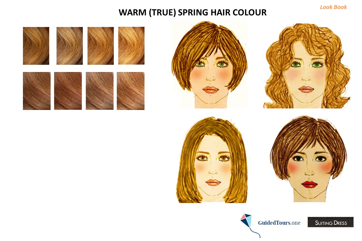
Warm (True) Spring hair can be medium golden blonde, strawberry blonde, copper, light golden brown, and medium golden brown. The hair has golden undertones to give us that warm feeling.
Usually, the best hair colour for Warm Springs is their natural hair colour, but if you want to change your natural hair colour, you should opt for another Warm Spring hair colour. Ultimately, we all look our best when we are working with what is happening to us naturally, rather than drastically changing ourselves.
Advising and choosing a new hair colour is, above all, respecting your medium-low value contrast level and the natural warm base. Great hair colours for you would be all Warm Spring natural hair colours mentioned above, as well as warm honey blonde or ginger blonde. more
On the image on your right, you can see how various Warm Spring representatives look with warm golden tones and light golden brown. If you decide to colour your hair, choose the colour with caution and avoid any cool blondes. It is important to stay in the same warm category so as not to create disharmony with the complexion.
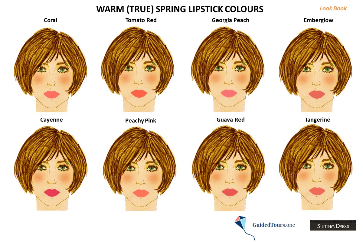
Warm (True) Spring lipstick colours are first of all warm and come from the pink, red, peach and coral colours included in the Warm (True) Spring Colour Palette. As Warm Spring’s natural appearance is warm, bright and light, Warm Spring lipstick is at its best when its similarly warm, intense and light.
Warm Springs can try very warm colours that are not too because they would complement the colours seen between their features. So, don’t be afraid to go for warmer colours like those that you can see on our Warm (True) Spring representative (coral, tomato red, Georgia peach, emberglow, cayenne, peachy pink, guava red, and tangerine).
As Warm (True) Springs are very warm, they should avoid cool, blue-based lipstick colours. Warm (True) Springs are medium bright, more
so avoid nude and completely matte lipsticks, because they will clash with your complexion and opt instead for glossy, shiny or satin finishes.
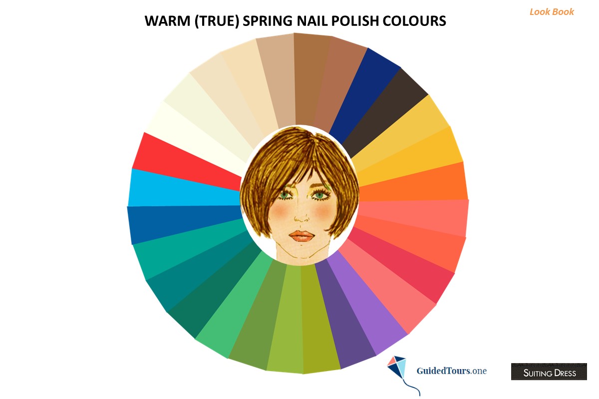
Warm (True) Spring nail polish colours are taken from the same colour palette that is used for clothing. On our image you can see various Warm Spring colours that you can choose from, but the best options are warm, bright and light as your features.
At the same time, Warm Springs who have a medium-low colour contrast, can combine 2 neutrals and 1 colour on their nails to create impressive designs, while Warm Springs who have a medium-high colour contrast can combine 2 colours and 1 neutral to create diverse designs. At the same time, Warm Springs who have a high colour contrast can combine 3 colours to create nail designs. The same best colour combinations that are relevant for clothes also apply for nail polish, but you should also keep in mind your value contrast number.
When you create nail designs, more
keep your nail polish colours to 2 neutrals and 1 colour, 2 colours and 1 neutral or 3 colours depending on your features to mimic the characteristics of your natural appearance.
Avoid cool nail polish colours, which are not suitable for Warm Springs.
Avoid cool nail polish colours, which are not suitable for Warm Springs.
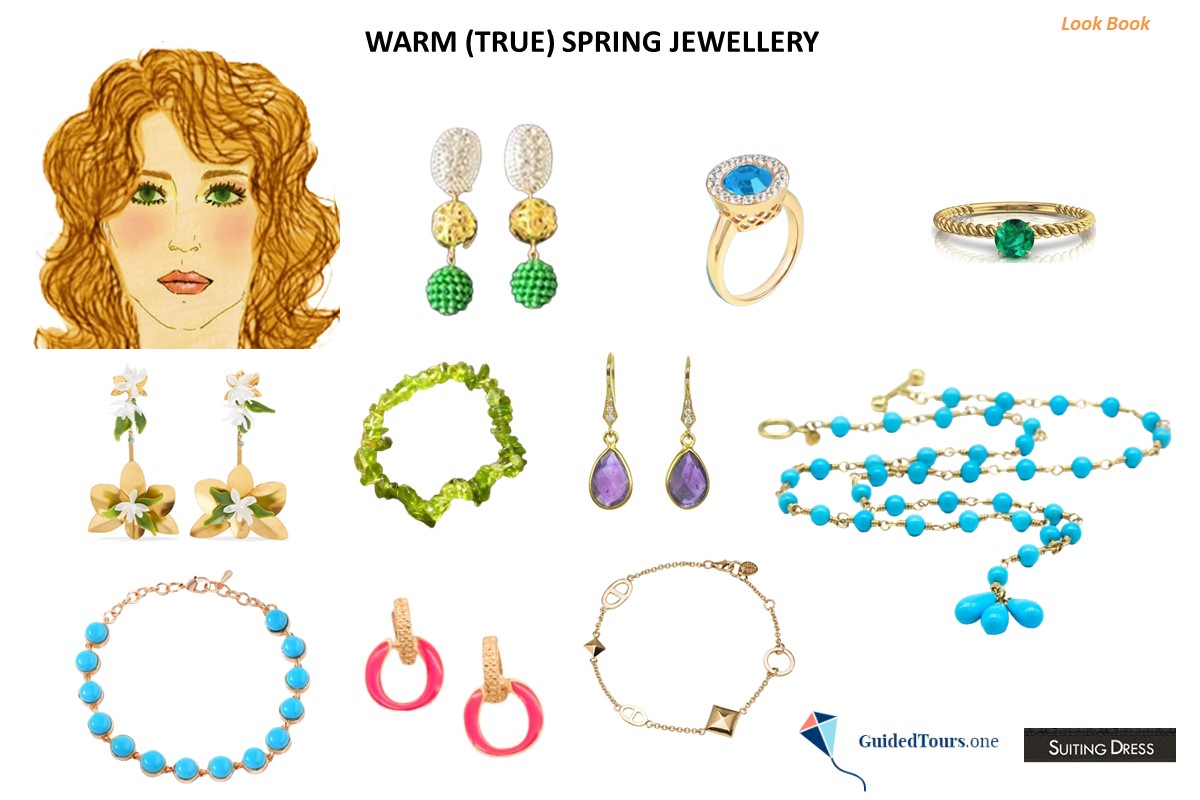
Warm/True Springs colouring has warm undertones, and silver is completely disharmonious with their skin. If you are a Warm Spring, your best metal will be gold, rather shiny than matte.
In terms of stones, turquoise, sunstone, andesine, carnelian, golden beryl, citrine, tsavorite and spessartite are ideal for Warm Springs. Cream pearls would also look great on Warm Springs, but we suggest you to opt for faux pearls to show that you care about oysters and molluscs. Pearl extraction is not considered ethical, as oysters and other molluscs only produce pearls as a response to a stressful environment. Faux pearls can be just as beautiful as natural pearls, and they are ethical.
On the image on your right, you can see some pieces of Warm Spring jewellery including earrings, more
rings, and a necklace. Besides taking into consideration what earrings to wear based on your season type, you should also consider the following: 1) what earrings (shape and size) are best for your face shape; 2) how to combine earrings with your dress style (for example modern, classic, sophisticated, etc.).
If you are not sure whether you are a Warm (True) Spring or not, you can contact us for an Online Personal Colour Analysis or purchase the Self Seasonal Colour Analysis Guide (15 €).
If you are not sure whether you are a Warm (True) Spring or not, you can contact us for an Online Personal Colour Analysis or purchase the Self Seasonal Colour Analysis Guide (15 €).
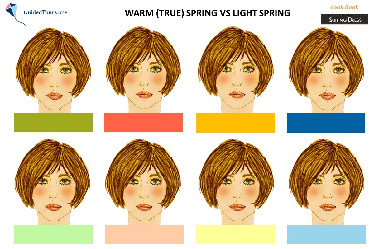
As you already know, Warm (True) Spring is the warmest season of the Spring family divided into Light Spring, Warm (True) Spring and Bright Spring. If you are a Warm Spring, then your colour palette is the warmest of the three spring palettes and contains some of the most golden colours of the spring family.
Warm (True) Spring sits between Light Spring and Bright Spring on the seasonal flow chart, but compared to Light Spring, Warm Spring is warmer in its undertones than Light Spring. Warm Spring is warm, bright and light, while Light Spring is light, warm and bright. Consequently, Warm Spring colours are less light, warmer and brighter than those of Light Spring. However, Warm Spring as a nearby season is very close both to Light Spring and Bright Spring. As a Warm Spring, you can borrow some colours both from Light Spring (warmer and darker colours on the palette) and Bright Spring (warmer and less bright colours on the palette), more
Warm (True) Spring sits between Light Spring and Bright Spring on the seasonal flow chart, but compared to Light Spring, Warm Spring is warmer in its undertones than Light Spring. Warm Spring is warm, bright and light, while Light Spring is light, warm and bright. Consequently, Warm Spring colours are less light, warmer and brighter than those of Light Spring. However, Warm Spring as a nearby season is very close both to Light Spring and Bright Spring. As a Warm Spring, you can borrow some colours both from Light Spring (warmer and darker colours on the palette) and Bright Spring (warmer and less bright colours on the palette), more
since some of them are close enough to the Warm Spring Colour Palette.
You can see by yourself how our Warm Spring representative looks with Warm Spring colours compared to Light Spring Colours (image 1). You can notice that all 4 colours included in the Warm Spring Colour Palette (first row from your left to your right: citron, tomato red, amber, and directoire blue) are in harmony with her natural colouring. As Light Spring has some cool influence being a nearby season to Light Summer, all 4 colours included in the palette (second row from your left to your right: menthol, peach, canary, and grape atomizer) are not warm enough for our Warm Spring representative. At the same time, they are too light and not bright enough, but we can see that overall there isn’t a big disharmony between the Light Spring colours and our Warm Spring representative, as if you took the Light Spring colours and added a few drops of warmth, darkness and brightness to them. If you find it difficult to decide whether you are a Warm Spring or a Light Spring, you can compare the same colours and see which ones will look better on you.
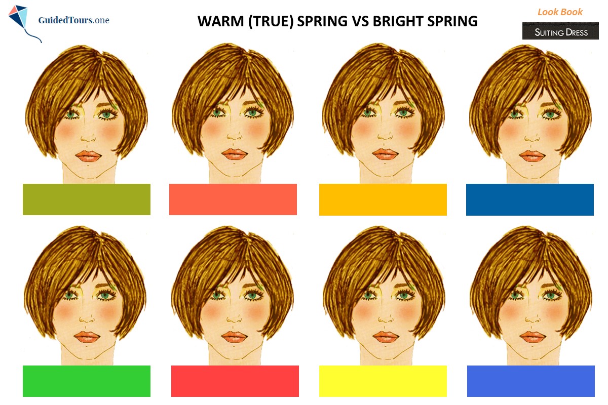
Compared to Warm (True) Spring colours, Bright Spring colours are brighter and less warm. Warm Spring is warm, bright and light, while Bright Spring is bright, warm and light.
In order to see how our Warm Spring representative looks with Warm Spring colours compared to Bright Spring colours (image 2) we selected some prominent colours from both palettes and draped her in them. You can notice that all 4 colours included in the Warm Spring Colour Palette (first row from your left to your right: citron, tomato red, amber, and directoire blue) are in harmony with her natural colouring. At the same time, the colours included in the Bright Spring Colour Palette (second row from your left to your right: lime green, coral red, daffodil, and bright blue) are a bit too bright and not warm enough for her.
To conclude we can say that because of the shared Spring base, our Warm Spring representative doesn’t look bad in any of the Spring family colours, but only Warm Spring colours are representative of colour harmony between head and body. To be most in harmony with your natural colouring, it’s better to use your Warm Spring colours.
You can see by yourself how our Warm Spring representative looks with Warm Spring colours compared to Light Spring Colours (image 1). You can notice that all 4 colours included in the Warm Spring Colour Palette (first row from your left to your right: citron, tomato red, amber, and directoire blue) are in harmony with her natural colouring. As Light Spring has some cool influence being a nearby season to Light Summer, all 4 colours included in the palette (second row from your left to your right: menthol, peach, canary, and grape atomizer) are not warm enough for our Warm Spring representative. At the same time, they are too light and not bright enough, but we can see that overall there isn’t a big disharmony between the Light Spring colours and our Warm Spring representative, as if you took the Light Spring colours and added a few drops of warmth, darkness and brightness to them. If you find it difficult to decide whether you are a Warm Spring or a Light Spring, you can compare the same colours and see which ones will look better on you.
Compared to Warm (True) Spring colours, Bright Spring colours are brighter and less warm. Warm Spring is warm, bright and light, while Bright Spring is bright, warm and light.
In order to see how our Warm Spring representative looks with Warm Spring colours compared to Bright Spring colours (image 2) we selected some prominent colours from both palettes and draped her in them. You can notice that all 4 colours included in the Warm Spring Colour Palette (first row from your left to your right: citron, tomato red, amber, and directoire blue) are in harmony with her natural colouring. At the same time, the colours included in the Bright Spring Colour Palette (second row from your left to your right: lime green, coral red, daffodil, and bright blue) are a bit too bright and not warm enough for her.
To conclude we can say that because of the shared Spring base, our Warm Spring representative doesn’t look bad in any of the Spring family colours, but only Warm Spring colours are representative of colour harmony between head and body. To be most in harmony with your natural colouring, it’s better to use your Warm Spring colours.
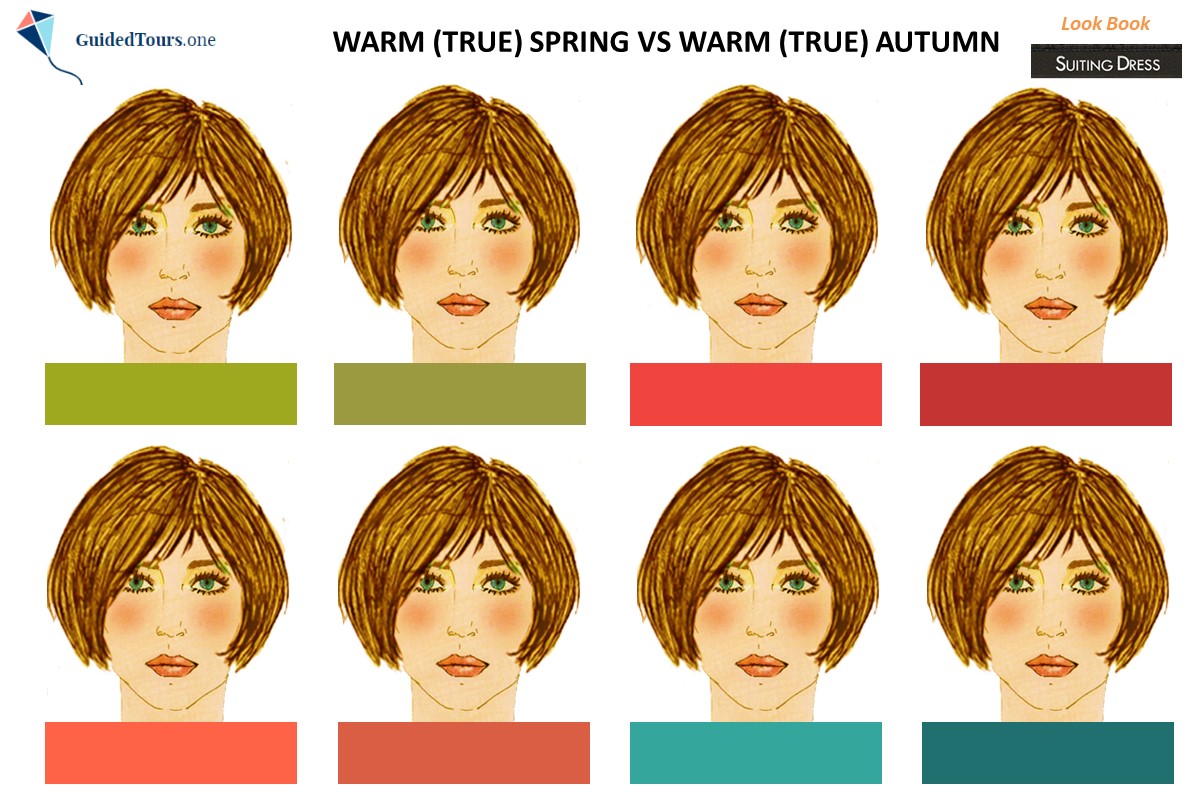
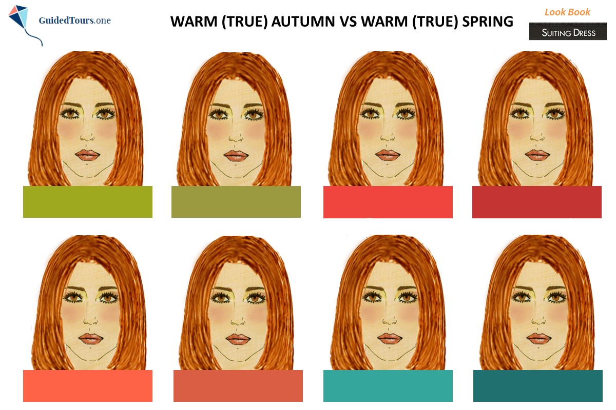
Warm (True) Spring and Warm (True) Autumn are the warmest of the 12 colour seasons, but the difference between the two is that Warm Spring is warm, bright, and light, while Warm (True) Autumn is warm, soft and dark.
These differences are noticed in the Warm Spring and Warm Autumn Colour Palettes. While Warm Autumn colours are softer and darker, Warm Spring colours are brighter and lighter.
Now that you know the difference in colour dimensions between Warm Spring and Warm Autumn, let’s have a look at our Warm Spring and Warm Autumn representatives and examine their features. Our Warm Spring representative (image 1) has a brighter and lighter appearance, while Warm Autumn (image 2) has a softer and darker appearance.
In order to have the confirmation that one is Warm Spring and the other one is Warm Autumn, more
we will drape them in a few Warm Spring and Warm Autumn colours, to see which ones work best on them. You can notice that all 4 colours (image 1) that were selected from the Warm Spring Colour Palette (first and second row from your left to your right: 1 citron, 3 red orange, 5 tomato red and 7 waterfall) harmonise really well with the natural colouring of our Warm Spring representative and blend in with her features. At the same time, we can see that Warm Autumn colours (first and second row from your left to your right: 2 split pea, 4 young mahogany, 6 red wire and 8 bayou) are a little bit too soft for our Warm Spring representative. The brighter Warm Spring colours lift her appearance and brighten her, while the softer Warm Autumn colours which contain grey drag her down a bit.
On the other hand, all 4 colours that were selected from the Warm Spring Colour Palette look very bright on our Warm Autumn representative (image 2), while Warm Autumn colours look stunning on her. The softer Warm Autumn colours harmonize very well with her natural colouring.
If you are a Warm Spring you can still borrow some colours from Warm Autumn, but look for lighter colours that are less soft on the Warm Autumn Colour Palette. If it is hard for you to differentiate between warm and bright colours or warm and soft colours when shopping, you can put on the fabric a piece of shiny and one of matte (brushed) gold jewellery (bracelet or ring that you wear). If shiny gold harmonizes better with the fabric, then the fabric colour is brighter, while if matte (brushed) gold harmonizes better with the fabric, then the fabric colour is softer.


Create amazing Warm Spring looks by using this Warm (True) Spring Colour and Style Look Book Kit (15 €) which includes 2 silhouettes and more than 100 clothes and accessories by style (Classic, Modern, Sophisticated, Romantic, Sporty, Natural, Bohemian and Gamine). Print the silhouettes, clothes and accessories (bags and shoes) on a good quality smooth and white A4 paper (120 grams is enough) and cut out only the clothes and accessories.
If you are a Warm Spring, thanks to this Warm Spring Colour and Style Look Book Kit, you can combine colours and styles to create beautiful outfits.
Steps and Conditions to purchase the Warm Spring Colour and Style Look Book Kit
Step 1: Contact us
Contact us to further purchase the Warm Spring Colour and Style Look Book Kit. more
Step 2: Receive the Warm Spring Colour and Style Look Book Kit
Once you buy the Warm Spring Colour and Style Look Book Kit (15 €) in PDF format (10 pages/slides), you will receive it by e-mail within 1 working day (24 hours). If you don’t receive it within this period of time, please, also check your spam folder.
Terms and Conditions
1. This is a digital purchase and this Warm Spring Colour and Style Look Book Kit will be sent to you as a PDF attachment by e-mail. You understand that no tangible product will be shipped to you.
2. All sales are final and no refunds or exchanges are available after purchase.
3. All files contained in this Warm Spring Colour and Style Look Book Kit are for personal use and are not allowed to be shared, reproduced or sold, either in parts or in whole.