Online (Virtual) Seasonal Colour Analysis, as well as In Person Colour Analysis, is designed to help you identify the colours that complement your natural skin undertone, eye colour and hair colour. This is an effective method that offers a deep-dive into your unique defining qualities/features and advices you what colours to use to enhance and bring them out.
This Self Seasonal Colour Analysis Guide (15 €, free for people who can't afford it and send requests on the last day of the month) based on the 12 sub-seasons in PowerPoint format (17 pages/slides) including Step-by-Step Instructions is the right tool for you to perform a self colour analysis at home. It is both for women and men and will be sent to you by e-mail after purchase.
1. Take photos for your Self Seasonal Colour Analysis (12 sub-seasons) following the steps in this DIY Colour Analysis Guide. more
1.1 Take minimum 4 high-resolution (jpeg or png format), close-up photos facing the camera (no glasses, jewellery or coloured contact lenses).
1.2 Do not wear any make-up and take 2 photos with your hair tied back and covered with a white hair scarf or covered with a white towel, and 2 with your hair left down (uncovered). If your hair is colour treated or grey, choose a photo with your earlier natural hair colour that is in line with the requirements mentioned below and self-analyse yourself based on this photo.
1.3 Wear a white colour top and make sure that your neck is also visible. Your face should fill most of the screen, and your neck should be entirely visible.
1.4 Take your photos inside in natural daylight in front of a window (about 3 feet/1 metre away from a north facing window if possible) on a sunny day, avoid direct sunlight and make sure that there are no shadows on your face. If possible, take them on a white and clear background.
1.5 Make sure that the photos accurately capture your skin tone/undertone and accurately represent your in-person colouring in natural daylight.
1.6 Make sure that your phone's flash is turned off and you have turned off any blurring filters.
2. Examine all 4 photos and choose 2 of them (one with your hair covered and one with your hair uncovered) which better represent your in-person colouring in natural daylight. If your hair is colour treated or grey, choose a photo with your earlier natural hair colour that is in line with the requirements mentioned above and better represents your in-person colouring in natural daylight.
3. Start your Self Seasonal Colour Analysis by analysing your Skin Undertone to see if it’s Warm or Cool.
Your Skin Undertone is the subtle natural hue beneath your skin's surface.
3.1 Insert your photo with your hair covered with a white hair scarf or towel in the first space where you can see the phrase “Insert your photo here!” (page 7), just above the digital drape.
3.2 Right-click on your photo and select the option: Send to Back - to move the photo behind the digital drape. Adjust the photo so that your neck is visible (just above the digital drape). Remove the phrase “Insert your photo here!”.
3.3 Repeat the same process for all spaces. Copy and paste your adjusted photo in the remaining spaces where you see the phrase “Insert your photo here!” above the digital drapes (8 digital drapes). more
Right-click on your photo and select the option: Send to Back - to move the photo behind the digital drape. Adjust the photo so that your neck is visible (just above the digital drape). Remove the phrase “Insert your photo here!” from all spaces.
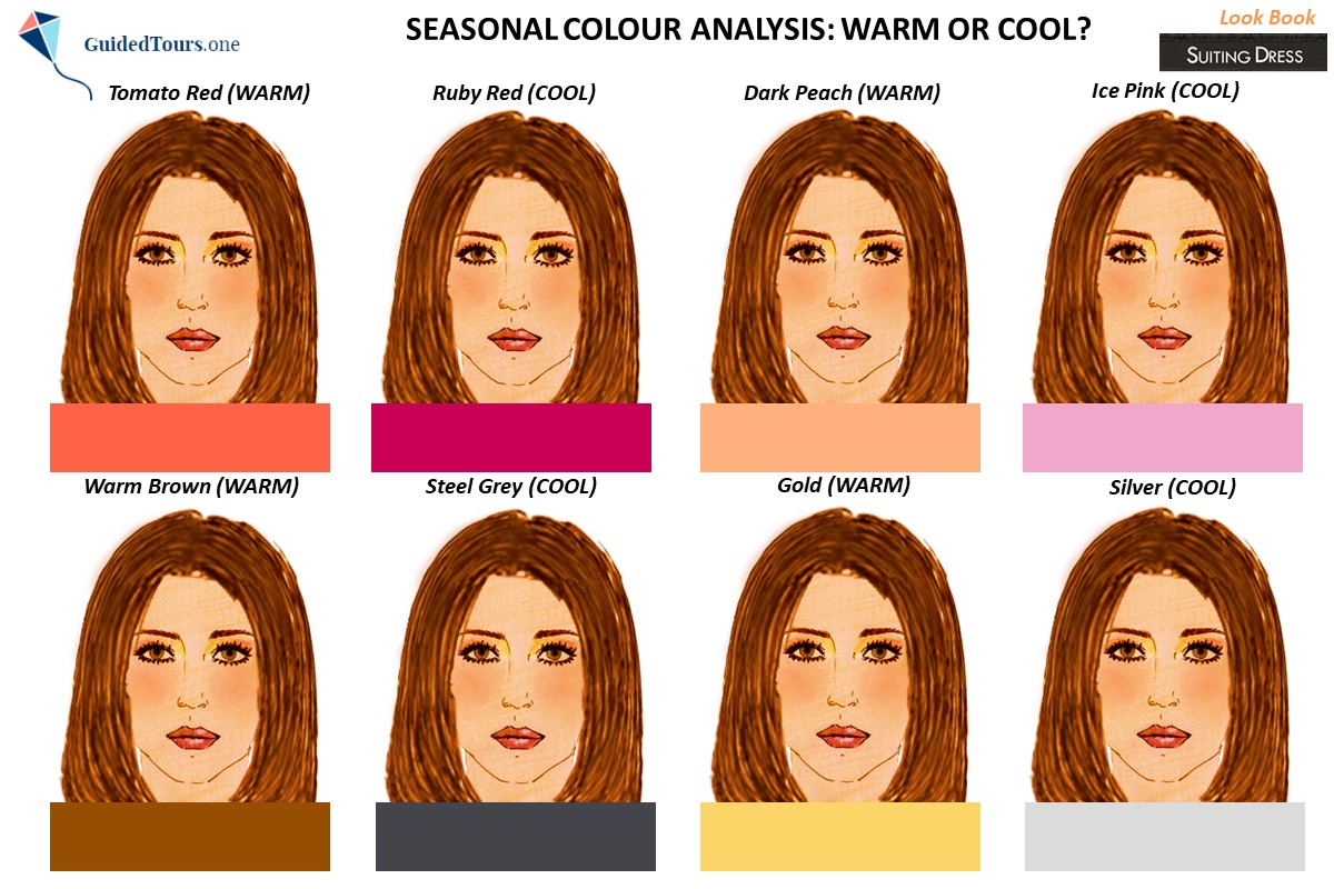
3.4 Compare the selected WARM and COOL colours and see which ones harmonize best with your skin undertone:
WARM vs COOL
Tomato Red (WARM) vs Ruby Red (COOL)
Dark Peach (WARM) vs Ice Pink (COOL)
Warm Brown (WARM) vs Steel Grey (COOL)
Gold (WARM) vs Silver (COOL)
3.5 Determine if you have a WARM or COOL skin undertone. If WARM colours harmonize best with your skin undertone, then you have a WARM skin undertone, while if COOL colours harmonize best with your skin undertone, then you have a COOL skin undertone.
Example. On the second image you can see a young girl with brown eyes and hair draped in warm and cool colours to determine her skin undertone. You can notice how the chosen warm colours harmonize best with her skin undertone in comparison with the chosen cool colours. The warm colours (tomato red, dark peach, warm brown and gold), which are yellow based, match her warm skin undertone making the entire image look very harmonious. There is a beautiful flow and harmony between her face and the digital warm colour drapes. Instead, the cool colours (ruby red, ice pink, steel grey and silver), which are blue based, don’t match her warm skin undertone making the entire image look disharmonious. There is no beautiful flow and harmony between her face and the digital cool colour drapes, but rather a clear border between her face and the digital drapes making the entire image look disconnected. The young girl doesn’t wear a white scarf and her hair is not covered with a towel either, as in this case the difference can be easily seen between colours. But to prevent any distraction and influence of your hair on the analysis, it is better to keep it away from your face and cover it with a white hair scarf or towel. For this step, you should focus on how your skin reacts to the colour, and removing the hair can help detect these nuances.

4. Carry on your Self Seasonal Colour Analysis by analysing your Chroma to see if you are Bright or Soft (Muted).
The chroma of a colour refers to the intensity or purity of a colour, its clarity, brightness or saturation. Colours with high percentage of grey are known as “low-chroma” or soft, and appear more muted and inclined towards grey, while colours with low percentage of grey or no grey, are considered “high chroma” or bright and appear more vivid.
4.1 If you have a WARM skin undertone, go to page 8 to determine if you are BRIGHT or SOFT (MUTED). If you have a COOL skin undertone, go to page 9 to determine if you are BRIGHT or SOFT (MUTED).
4.2 Insert your photo with your hair left down (uncovered) in the first space where you can see the phrase “Insert your photo here!”, more
just above the digital drape.
4.3 Right-click on your photo and select the option: Send to Back - to move the photo behind the digital drape. Adjust the photo so that your neck is visible (just above the digital drape). Remove the phrase “Insert your photo here!”.
4.4 Repeat the same process for all spaces. Copy and paste your adjusted photo in the remaining spaces where you see the phrase “Insert your photo here!” above the digital drapes (8 digital drapes). Right-click on your photo and select the option: Send to Back - to move the photo behind the digital drape. Adjust the photo so that your neck is visible (just above the digital drape). Remove the phrase “Insert your photo here!” from all spaces.
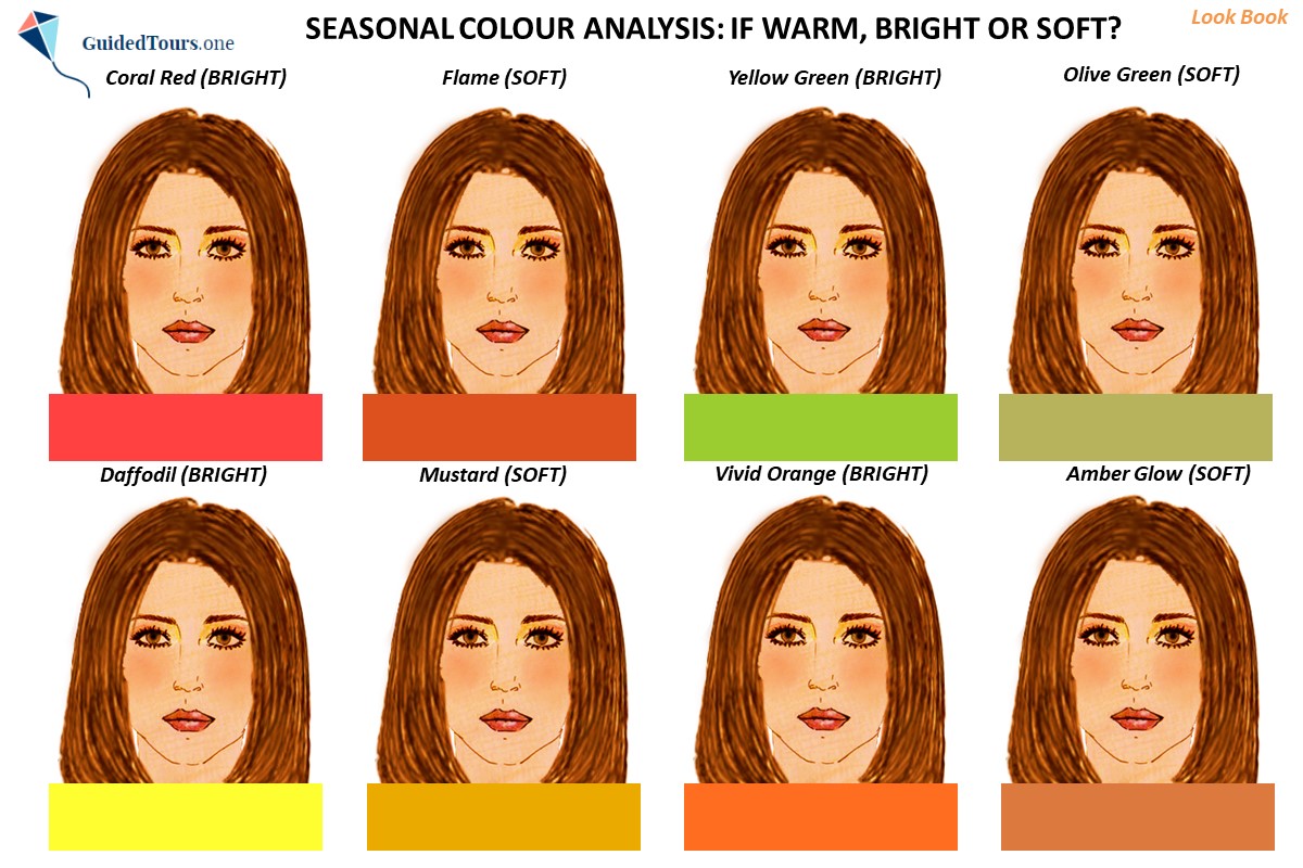
4.5 Compare the selected BRIGHT and SOFT (MUTED) colours and see which ones harmonize best with your natural colouring:
WARM: BRIGHT vs SOFT (page 8)
Coral Red (BRIGHT) vs Flame (SOFT)
Yellow Green (BRIGHT) vs Olive Green (SOFT)
Daffodil (BRIGHT) vs Mustard (SOFT)
Vivid Orange (BRIGHT) vs Amber Glow (SOFT)
COOL: BRIGHT vs SOFT (page 9)
Strawberry Moon (BRIGHT) vs Sea Pink (SOFT)
Emerald Green (BRIGHT) vs Neptune Green (SOFT)
Navy (BRIGHT) vs Sultry Navy (SOFT)
Pink Raspberry (BRIGHT) vs Anemone (SOFT)
4.6 Determine if you are BRIGHT or SOFT (MUTED). If BRIGHT colours harmonize best with your natural colouring, then you are BRIGHT, while if SOFT colours harmonize best with your natural colouring, then you are SOFT.
Example. On the second image you can see the same young girl draped in warm colours which are bright and soft, in order to determine her chroma. Both bright and soft colours match her skin undertone because they are all warm colours, but the difference between them consists in the fact that some colours are very intense and saturated (bright) and appear more vivid, while others are less intense (soft) and appear more greyish. You can notice that intensity wise, the chosen bright colours (coral red, yellow green, daffodil and vivid orange) are more similar to her natural colours than the chosen soft colours (flame, olive green, mustard and amber glow), which are not intense enough for her. The bright colours match better the colour intensity of her natural features and brighten them up, while the soft colours don’t match the colour intensity of her natural features, and drag them down, as they contain too much grey for her. Therefore, she is warm and bright.
4.3 Right-click on your photo and select the option: Send to Back - to move the photo behind the digital drape. Adjust the photo so that your neck is visible (just above the digital drape). Remove the phrase “Insert your photo here!”.
4.4 Repeat the same process for all spaces. Copy and paste your adjusted photo in the remaining spaces where you see the phrase “Insert your photo here!” above the digital drapes (8 digital drapes). Right-click on your photo and select the option: Send to Back - to move the photo behind the digital drape. Adjust the photo so that your neck is visible (just above the digital drape). Remove the phrase “Insert your photo here!” from all spaces.
4.5 Compare the selected BRIGHT and SOFT (MUTED) colours and see which ones harmonize best with your natural colouring:
WARM: BRIGHT vs SOFT (page 8)
Coral Red (BRIGHT) vs Flame (SOFT)
Yellow Green (BRIGHT) vs Olive Green (SOFT)
Daffodil (BRIGHT) vs Mustard (SOFT)
Vivid Orange (BRIGHT) vs Amber Glow (SOFT)
COOL: BRIGHT vs SOFT (page 9)
Strawberry Moon (BRIGHT) vs Sea Pink (SOFT)
Emerald Green (BRIGHT) vs Neptune Green (SOFT)
Navy (BRIGHT) vs Sultry Navy (SOFT)
Pink Raspberry (BRIGHT) vs Anemone (SOFT)
4.6 Determine if you are BRIGHT or SOFT (MUTED). If BRIGHT colours harmonize best with your natural colouring, then you are BRIGHT, while if SOFT colours harmonize best with your natural colouring, then you are SOFT.
Example. On the second image you can see the same young girl draped in warm colours which are bright and soft, in order to determine her chroma. Both bright and soft colours match her skin undertone because they are all warm colours, but the difference between them consists in the fact that some colours are very intense and saturated (bright) and appear more vivid, while others are less intense (soft) and appear more greyish. You can notice that intensity wise, the chosen bright colours (coral red, yellow green, daffodil and vivid orange) are more similar to her natural colours than the chosen soft colours (flame, olive green, mustard and amber glow), which are not intense enough for her. The bright colours match better the colour intensity of her natural features and brighten them up, while the soft colours don’t match the colour intensity of her natural features, and drag them down, as they contain too much grey for her. Therefore, she is warm and bright.


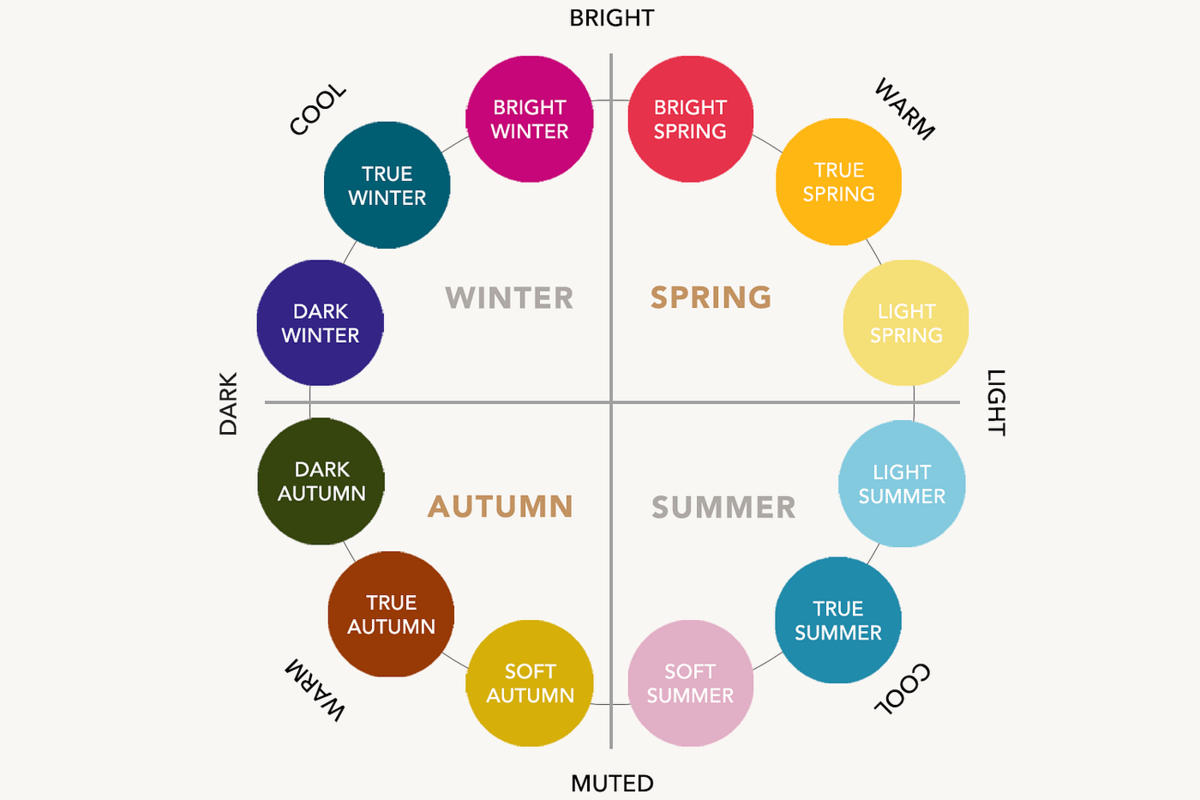
5. Carry on your Self Seasonal Colour Analysis to determine your Sub-season.
5.1 If you are WARM and BRIGHT (SPRING), go to page 10 and 11 to determine your sub-season (Light Spring, True Spring or Bright Spring).
If you are WARM and SOFT (AUTUMN), go to page 12 and 13 to determine your sub-season (Soft Autumn, True Autumn or Dark Autumn).
If you are COOL and BRIGHT (WINTER), go to page 14 and 15 to determine your sub-season (Dark Winter, True Winter or Bright Winter).
If you are COOL and SOFT (SUMMER), go to page 16 and 17 to determine your sub-season (Light Summer, True Summer or Soft Summer).
5.2 Repeat actions mentioned at steps 4.2, 4.3, and 4.4 on page 10 and 11 if you are a SPRING, 12 and 13 if you are an AUTUMN, 14 and 15 if you are a WINTER, 16 and 17 if you are a SUMMER. more
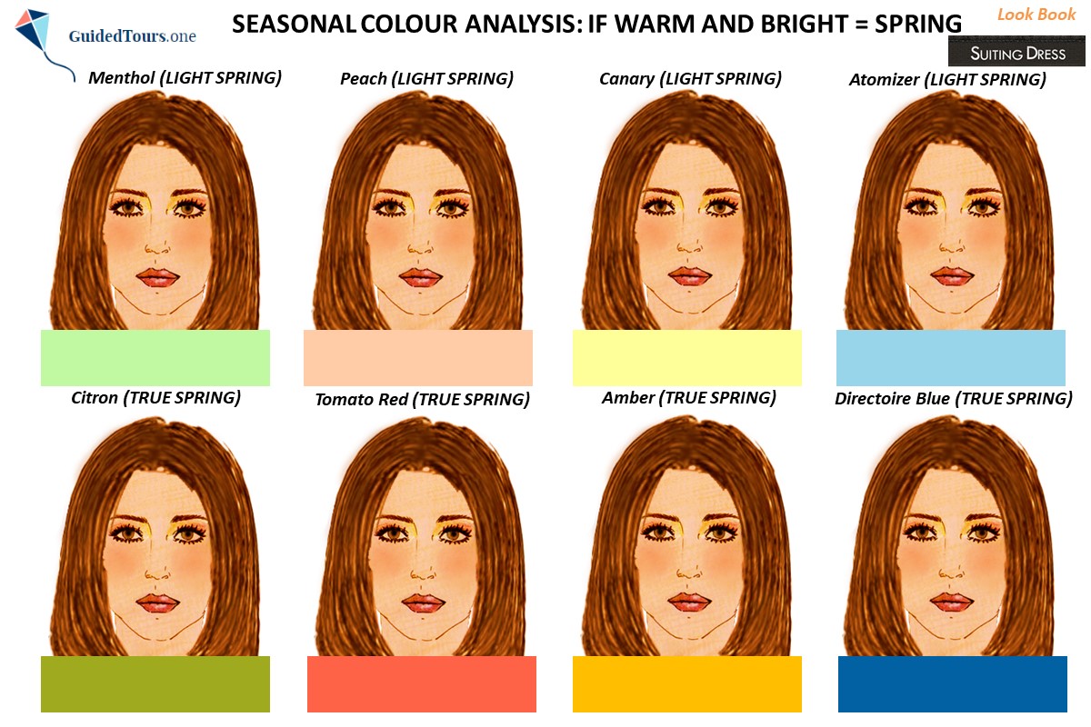
5.3 If you are WARM and BRIGHT, compare the selected SPRING colours (page 10 and 11) and see which ones harmonize best with your natural colouring:
LIGHT SPRING vs TRUE SPRING (page 10)
Menthol (LIGHT SPRING) vs Citron (TRUE SPRING)
Peach (LIGHT SPRING) vs Tomato Red (TRUE SPRING)
Canary (LIGHT SPRING) vs Amber (TRUE SPRING)
Atomizer (LIGHT SPRING) vs Directoire Blue (TRUE SPRING)
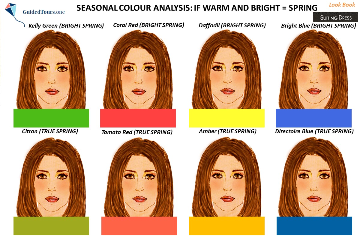
BRIGHT SPRING vs TRUE SPRING (page 11)
Kelly Green (BRIGHT SPRING) vs Citron (TRUE SPRING)
Coral Red (BRIGHT SPRING) vs Tomato Red (TRUE SPRING)
Daffodil (BRIGHT SPRING) vs Amber (TRUE SPRING)
Bright Blue (BRIGHT SPRING) vs Directoire Blue (TRUE SPRING)
If you are WARM and SOFT, compare the selected AUTUMN colours (page 12 and 13) and see which ones harmonize best with your natural colouring:
SOFT AUTUMN vs TRUE AUTUMN (page 12)
Sage (SOFT AUTUMN) vs Guacamole (TRUE AUTUMN)
Blooming Dahlia (SOFT AUTUMN) vs Terracotta (AUTUMN)
Soft Orange (SOFT AUTUMN) vs Burnt Orange (TRUE AUTUMN)
Bristol (SOFT AUTUMN) vs Deep Teal (TRUE AUTUMN)
DARK AUTUMN vs TRUE AUTUMN (page 13)
Darkest Forest (DARK AUTUMN) vs Guacamole (TRUE AUTUMN)
Rosewood (DARK AUTUMN) vs Terracotta (TRUE AUTUMN)
Martian Ironcrust (DARK AUTUMN) vs Burnt Orange (TRUE AUTUMN)
Dark Pine (DARK AUTUMN) vs Deep Teal (TRUE AUTUMN)
If you are COOL and BRIGHT, compare the selected WINTER colours (page 14 and 15) and see which ones harmonize best with your natural colouring:
DARK WINTER vs TRUE WINTER (page 14)
Deep Pine (DARK WINTER) vs Tidepool (TRUE WINTER)
Fruit Dove (DARK WINTER) vs Magenta (TRUE WINTER)
Cetacean Blue (DARK WINTER) vs Cobalt (TRUE WINTER)
Grape Royale (DARK WINTER) vs Cadmium Violet (TRUE WINTER)
BRIGHT WINTER vs TRUE WINTER (page 15)
Emerald Green (BRIGHT WINTER) vs Tidepool (TRUE WINTER)
Hot Pink (BRIGHT WINTER) vs Magenta (TRUE WINTER)
Blue Blossom (BRIGHT WINTER) vs Cobalt (TRUE WINTER)
Bright Amethyst (BRIGHT WINTER) vs Cadmium Violet (TRUE WINTER)
If you are COOL and SOFT, compare the selected SUMMER colours (page 16 and 17) and see which ones harmonize best with your natural colouring:
LIGHT SUMMER vs TRUE SUMMER (page 16)
Cabbage (LIGHT SUMMER) vs Jungle Green (TRUE SUMMER)
Petal Pink (LIGHT SUMMER) vs Fandango (TRUE SUMMER)
Light Blue (LIGHT SUMMER) vs Nebula Blue (TRUE SUMMER)
Purple Heather (LIGHT SUMMER) vs Corsican Blue (TRUE SUMMER)
SOFT SUMMER vs TRUE SUMMER (page 17)
Hazy Green (SOFT SUMMER) vs Jungle Green (TRUE SUMMER)
Rouge (SOFT SUMMER) vs Fandango (TRUE SUMMER)
Riverside Blue (SOFT SUMMER) vs Nebula Blue (TRUE SUMMER)
Orchid Haze (SOFT SUMMER) vs Corsican Blue (TRUE SUMMER)
5.4 Determine your sub-season and see what kind of SPRING, AUTUMN, WINTER or SUMMER are you:
SPRING (Light Spring, True Spring, Bright Spring)
AUTUMN (Soft Autumn, True Autumn, Dark Autumn)
WINTER (Dark Winter, True Winter, Bright Winter)
SUMMER (Light Summer, True Summer, Soft Summer)
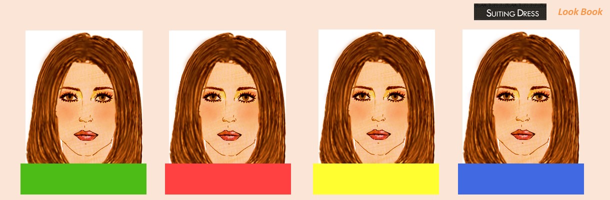
Example. On the second and fourth image you can see the same young girl draped in warm and bright colours belonging to Spring season, in order to determine her sub-season. As you already know the Spring family is divided into Light Spring, True Spring and Bright Spring. First, we are going to compare Light Spring and True (Warm) Spring colours on her. While Light Spring is the lightest sub-season of the Spring family and is only neutral warm, True (Warm) Spring is the warmest sub-season of the Spring family and is not as light as Light Spring. Light is the main colour aspect of Light Spring, while Warm is the main colour aspect of True (Warm) Spring. As we can see on the second image, Light Spring colours are too light for the selected young girl, while True (Warm) Spring colours look better on her. Now, let’s compare Bright (Clear) Spring and True (Warm) Spring colours on her. While True (Warm) Spring is the warmest sub-season of the Spring family and is extremely warm, Bright (Clear) Spring is the brightest sub-season of the Spring family and is not as warm as True (Warm) Spring. Therefore, Bright Spring is bright and warm, while True (Warm) Spring is warm and bright. As we can see on the fourth image, Warm (True) Spring colours are not enough bright for her, while Bright (Clear) Spring colours suit her better and match her natural colouring. Therefore, she is a Bright (Clear) Spring.
5.1 If you are WARM and BRIGHT (SPRING), go to page 10 and 11 to determine your sub-season (Light Spring, True Spring or Bright Spring).
If you are WARM and SOFT (AUTUMN), go to page 12 and 13 to determine your sub-season (Soft Autumn, True Autumn or Dark Autumn).
If you are COOL and BRIGHT (WINTER), go to page 14 and 15 to determine your sub-season (Dark Winter, True Winter or Bright Winter).
If you are COOL and SOFT (SUMMER), go to page 16 and 17 to determine your sub-season (Light Summer, True Summer or Soft Summer).
5.2 Repeat actions mentioned at steps 4.2, 4.3, and 4.4 on page 10 and 11 if you are a SPRING, 12 and 13 if you are an AUTUMN, 14 and 15 if you are a WINTER, 16 and 17 if you are a SUMMER. more
5.3 If you are WARM and BRIGHT, compare the selected SPRING colours (page 10 and 11) and see which ones harmonize best with your natural colouring:
LIGHT SPRING vs TRUE SPRING (page 10)
Menthol (LIGHT SPRING) vs Citron (TRUE SPRING)
Peach (LIGHT SPRING) vs Tomato Red (TRUE SPRING)
Canary (LIGHT SPRING) vs Amber (TRUE SPRING)
Atomizer (LIGHT SPRING) vs Directoire Blue (TRUE SPRING)
BRIGHT SPRING vs TRUE SPRING (page 11)
Kelly Green (BRIGHT SPRING) vs Citron (TRUE SPRING)
Coral Red (BRIGHT SPRING) vs Tomato Red (TRUE SPRING)
Daffodil (BRIGHT SPRING) vs Amber (TRUE SPRING)
Bright Blue (BRIGHT SPRING) vs Directoire Blue (TRUE SPRING)
If you are WARM and SOFT, compare the selected AUTUMN colours (page 12 and 13) and see which ones harmonize best with your natural colouring:
SOFT AUTUMN vs TRUE AUTUMN (page 12)
Sage (SOFT AUTUMN) vs Guacamole (TRUE AUTUMN)
Blooming Dahlia (SOFT AUTUMN) vs Terracotta (AUTUMN)
Soft Orange (SOFT AUTUMN) vs Burnt Orange (TRUE AUTUMN)
Bristol (SOFT AUTUMN) vs Deep Teal (TRUE AUTUMN)
DARK AUTUMN vs TRUE AUTUMN (page 13)
Darkest Forest (DARK AUTUMN) vs Guacamole (TRUE AUTUMN)
Rosewood (DARK AUTUMN) vs Terracotta (TRUE AUTUMN)
Martian Ironcrust (DARK AUTUMN) vs Burnt Orange (TRUE AUTUMN)
Dark Pine (DARK AUTUMN) vs Deep Teal (TRUE AUTUMN)
If you are COOL and BRIGHT, compare the selected WINTER colours (page 14 and 15) and see which ones harmonize best with your natural colouring:
DARK WINTER vs TRUE WINTER (page 14)
Deep Pine (DARK WINTER) vs Tidepool (TRUE WINTER)
Fruit Dove (DARK WINTER) vs Magenta (TRUE WINTER)
Cetacean Blue (DARK WINTER) vs Cobalt (TRUE WINTER)
Grape Royale (DARK WINTER) vs Cadmium Violet (TRUE WINTER)
BRIGHT WINTER vs TRUE WINTER (page 15)
Emerald Green (BRIGHT WINTER) vs Tidepool (TRUE WINTER)
Hot Pink (BRIGHT WINTER) vs Magenta (TRUE WINTER)
Blue Blossom (BRIGHT WINTER) vs Cobalt (TRUE WINTER)
Bright Amethyst (BRIGHT WINTER) vs Cadmium Violet (TRUE WINTER)
If you are COOL and SOFT, compare the selected SUMMER colours (page 16 and 17) and see which ones harmonize best with your natural colouring:
LIGHT SUMMER vs TRUE SUMMER (page 16)
Cabbage (LIGHT SUMMER) vs Jungle Green (TRUE SUMMER)
Petal Pink (LIGHT SUMMER) vs Fandango (TRUE SUMMER)
Light Blue (LIGHT SUMMER) vs Nebula Blue (TRUE SUMMER)
Purple Heather (LIGHT SUMMER) vs Corsican Blue (TRUE SUMMER)
SOFT SUMMER vs TRUE SUMMER (page 17)
Hazy Green (SOFT SUMMER) vs Jungle Green (TRUE SUMMER)
Rouge (SOFT SUMMER) vs Fandango (TRUE SUMMER)
Riverside Blue (SOFT SUMMER) vs Nebula Blue (TRUE SUMMER)
Orchid Haze (SOFT SUMMER) vs Corsican Blue (TRUE SUMMER)
5.4 Determine your sub-season and see what kind of SPRING, AUTUMN, WINTER or SUMMER are you:
SPRING (Light Spring, True Spring, Bright Spring)
AUTUMN (Soft Autumn, True Autumn, Dark Autumn)
WINTER (Dark Winter, True Winter, Bright Winter)
SUMMER (Light Summer, True Summer, Soft Summer)
Example. On the second and fourth image you can see the same young girl draped in warm and bright colours belonging to Spring season, in order to determine her sub-season. As you already know the Spring family is divided into Light Spring, True Spring and Bright Spring. First, we are going to compare Light Spring and True (Warm) Spring colours on her. While Light Spring is the lightest sub-season of the Spring family and is only neutral warm, True (Warm) Spring is the warmest sub-season of the Spring family and is not as light as Light Spring. Light is the main colour aspect of Light Spring, while Warm is the main colour aspect of True (Warm) Spring. As we can see on the second image, Light Spring colours are too light for the selected young girl, while True (Warm) Spring colours look better on her. Now, let’s compare Bright (Clear) Spring and True (Warm) Spring colours on her. While True (Warm) Spring is the warmest sub-season of the Spring family and is extremely warm, Bright (Clear) Spring is the brightest sub-season of the Spring family and is not as warm as True (Warm) Spring. Therefore, Bright Spring is bright and warm, while True (Warm) Spring is warm and bright. As we can see on the fourth image, Warm (True) Spring colours are not enough bright for her, while Bright (Clear) Spring colours suit her better and match her natural colouring. Therefore, she is a Bright (Clear) Spring.
Step 1: Contact us
Contact us to further purchase your Self Seasonal Colour Analysis Guide.
Step 2: Receive Your Self Seasonal Colour Analysis Guide
Once you buy your Self Seasonal Colour Analysis Guide (15 €) based on the 12 sub-seasons in PowerPoint format (17 pages/slides), you will receive it by e-mail within 1 working day (24 hours). If you don’t receive it within this period of time, please, also check your spam folder.
Terms and Conditions
1. This is a digital purchase and your Self Seasonal Colour Analysis Guide will be sent to you as a Power Point attachment by e-mail. You understand that no tangible product will be shipped to you.
2. All sales are final and no refunds or exchanges are available after purchase. more
3. All files contained in this Self Seasonal Colour Analysis Guide are for personal use and are not allowed to be shared or sold, either in parts or in whole.