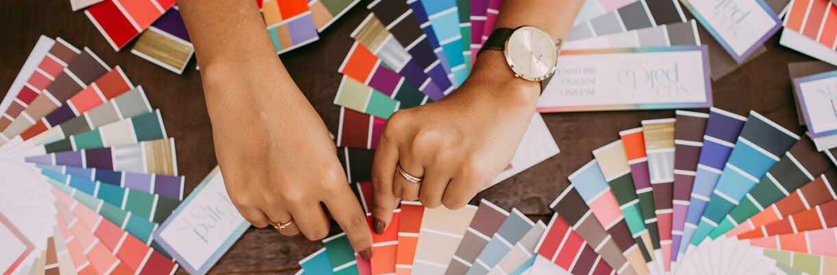
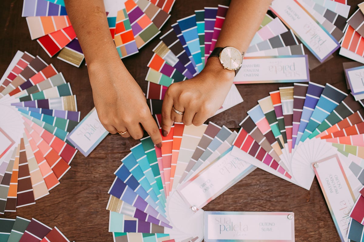
Online (Virtual) Seasonal Colour Analysis, as well as In Person Colour Analysis, is designed to help you identify the colours that complement your natural skin undertone, eye colour and hair colour. This is an effective method that offers a deep-dive into your unique defining qualities/features and advices you what colours to use to enhance and bring them out.
This Virtual Colour Analysis based on the 12 season types includes:
Standard Package (40 €)
- Your Colour Analysis;
- Your Colour Palette (30 colours and neutrals);
- Your Jewellery. more
The Analysis will provide you with a Standard Colour Analysis Report (15 pages/slides) that will be sent to you by e-mail in PDF format. It is both for women and men.
Premium Package (100 €)
- Your Colour Analysis;
- Your Value Contrast and Colour Contrast;
- Your Jewellery;
- Your Colour Palette (30 colours and neutrals);
- Your Best Colour Combinations.
The Analysis will provide you with a Premium Colour Analysis Report (21 pages/slides) that will be sent to you by e-mail in PDF format. It is both for women and men. For a group of two or more people the price will be 90 € per person.
At the same time, you can receive a free Standard Online Colour Analysis as a gift upon purchase of a tour in Italy or Spain of at least 1,000 €.
Below you will find what exactly each of these chapters includes.
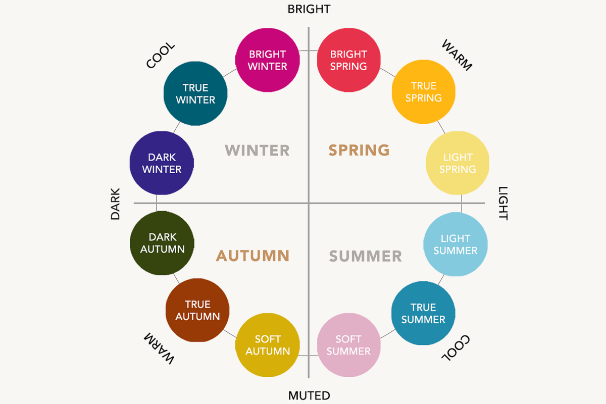
There are 12 season types, because each of the 4 seasons (Winter, Spring, Summer, Autumn) has three variations. To determine your season type, we will analyse your features (hair, eyes and skin) and identify which of the six colour characteristics is most dominant in your features (primary colour aspect) and which is your secondary aspect:
Hue: Warm or Cool
Value: Light or Dark
Chroma: Soft or Bright.
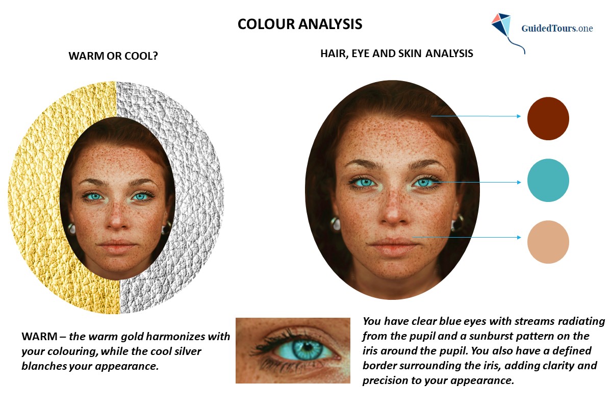
See an example of Colour Analysis below and the image on your right (Bright Spring representative).
We will start the Analysis by examining her features (hair, eyes and skin).
Hair: She has dark copper hair colour that is typically warm and golden highlights. more
Eyes: She has clear green eyes with streams radiating from the pupil.
Skin: She has a light skin with neutral-warm undertones.
At the same time, we can see that the warm gold harmonizes with her colouring, while the cool silver blanches her appearance.
Examining her features, we see that she is warm and clear, and either a Warm Spring (dominant characteristic is Warm) or a Bright Spring (dominant characteristic is Bright/Clear). Taking into consideration her neutral warm skin undertones she is rather a Bright Spring than a Warm Spring, but we will continue our analysis to be sure.
In order to confirm her sub-season, we will use the digital drapes and continue our Colour Analysis by focusing on 3 steps:
1. Identification of her Skin Undertone (Warm or Cool),
2. Identification of her Intensity / Chroma (Bright or Soft),
3. Determination of her Sub-season.
So, let’s continue our Colour Analysis.
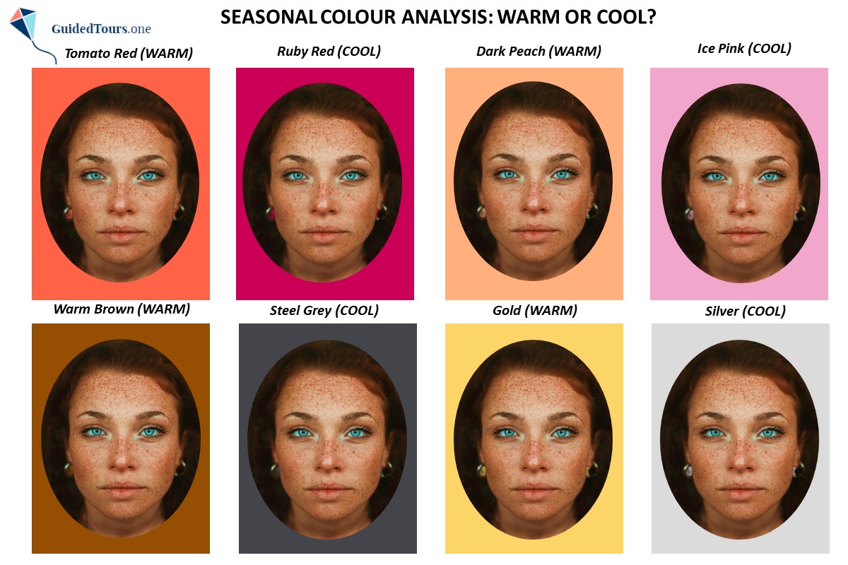
1. Identification of her Skin Undertone (Warm or Cool)
On the second image you can see her draped in warm and cool colours to determine her skin undertone. You can notice how the chosen warm colours harmonize best with her skin undertone in comparison with the chosen cool colours. The warm colours (tomato red, dark peach, warm brown and gold), which are yellow based, match her warm skin undertone making the entire image look very harmonious. There is a beautiful flow and harmony between her face and the digital warm colour drapes. Instead, the cool colours (ruby red, ice pink, steel grey and silver), which are blue based, don’t match her warm skin undertone making the entire image look disharmonious. There is no beautiful flow and harmony between her face and the digital cool colour drapes, but rather a clear border between her face and the digital drapes making the entire image look disconnected. The young girl doesn’t wear a white scarf and her hair is not covered with a towel either, as in this case the difference can be easily seen between colours. But to prevent any distraction and influence of your hair on the analysis, it is better to keep it away from your face and cover it with a white hair scarf or towel. For this step, you should focus on how your skin reacts to the colour, and removing the hair can help detect these nuances.
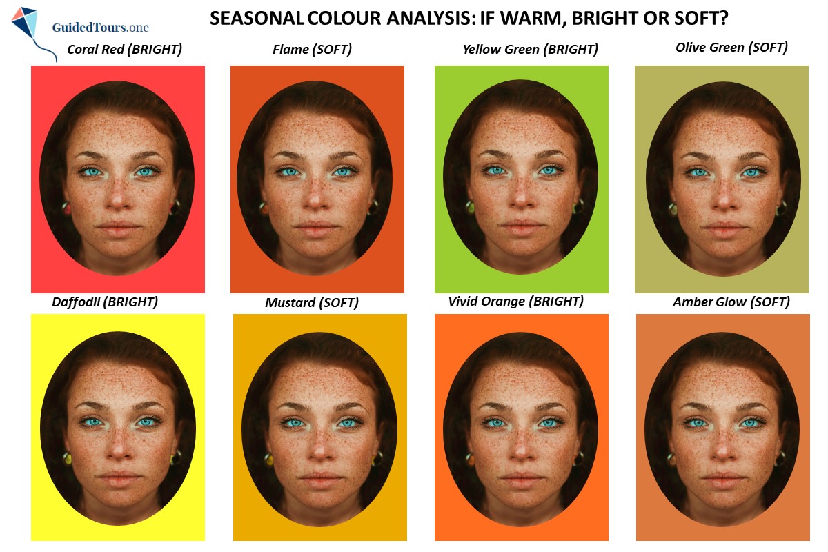
2. Identification of her Intensity / Chroma (Bright or Soft)
On the third image you can see her draped in warm colours which are bright and soft, in order to determine her chroma. Both bright and soft colours match her skin undertone because they are all warm colours, but the difference between them consists in the fact that some colours are very intense and saturated (bright) and appear more vivid, while others are less intense (soft) and appear more greyish. You can notice that intensity wise, the chosen bright colours (coral red, yellow green, daffodil and vivid orange) are more similar to her natural colours than the chosen soft colours (flame, olive green, mustard and amber glow), which are not intense enough for her. The bright colours match better the colour intensity of her natural features and brighten them up, while the soft colours don’t match the colour intensity of her natural features, and drag them down, as they contain too much grey for her. Therefore, she is warm and bright and belongs to Spring season.
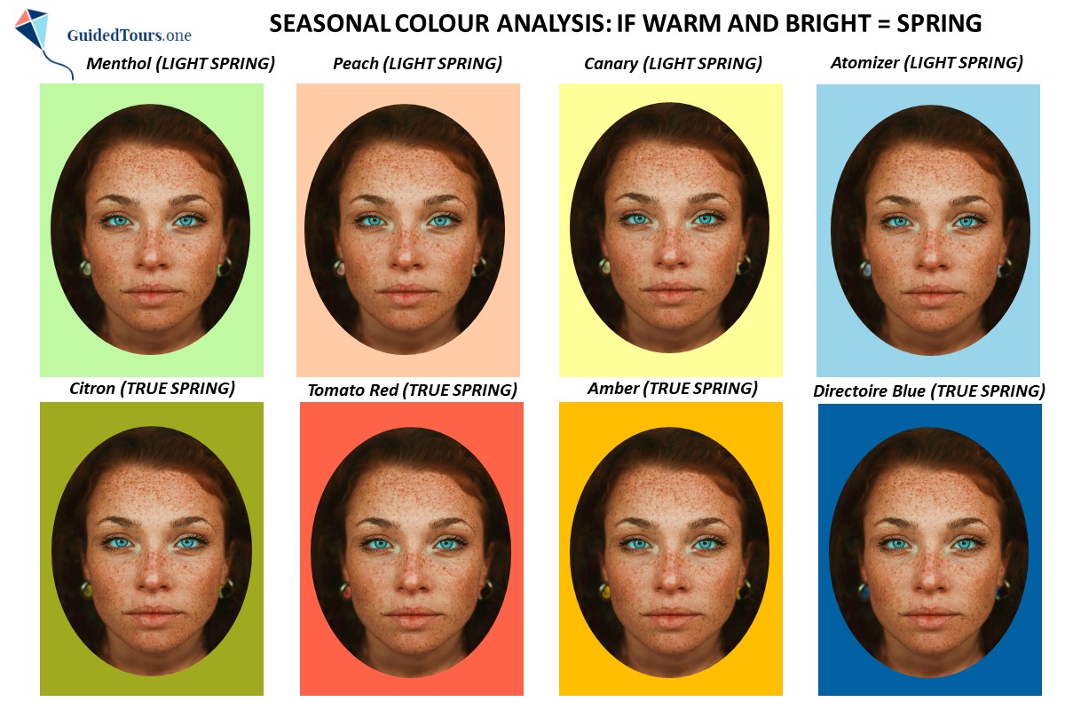
3. Determination of her Sub-season (Light Spring, Warm Spring or Bright Spring)
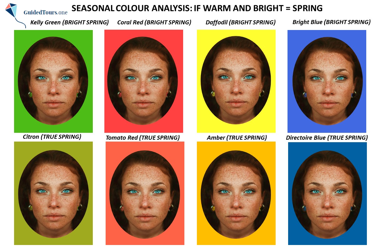
On the fourth and fifth image you can see her draped in warm and bright colours belonging to Spring season, in order to determine her sub-season. As you already know the Spring family is divided into Light Spring, True Spring and Bright Spring. First, we are going to compare Light Spring and True (Warm) Spring colours on her. While Light Spring is the lightest sub-season of the Spring family and is only neutral warm, True (Warm) Spring is the warmest sub-season of the Spring family and is not as light as Light Spring. Light is the main colour aspect of Light Spring, while Warm is the main colour aspect of True (Warm) Spring. As we can see on the fourth image, Light Spring colours are too light for the selected young girl, while True (Warm) Spring colours look better on her. Now, let’s compare Bright (Clear) Spring and True (Warm) Spring colours on her. While True (Warm) Spring is the warmest sub-season of the Spring family and is extremely warm, Bright (Clear) Spring is the brightest sub-season of the Spring family and is not as warm as True (Warm) Spring. Therefore, Bright Spring is bright and warm, while True (Warm) Spring is warm and bright. As we can see on the fifth image, Warm (True) Spring colours are not enough bright for her, while Bright (Clear) Spring colours suit her better and match her natural colouring. Therefore, she is a Bright (Clear) Spring.
To go further with the analysis, we will check what is her Value Contrast and Colour Contrast (see next chapter).
Hue: Warm or Cool
Value: Light or Dark
Chroma: Soft or Bright.
See an example of Colour Analysis below and the image on your right (Bright Spring representative).
We will start the Analysis by examining her features (hair, eyes and skin).
Hair: She has dark copper hair colour that is typically warm and golden highlights. more
Eyes: She has clear green eyes with streams radiating from the pupil.
Skin: She has a light skin with neutral-warm undertones.
At the same time, we can see that the warm gold harmonizes with her colouring, while the cool silver blanches her appearance.
Examining her features, we see that she is warm and clear, and either a Warm Spring (dominant characteristic is Warm) or a Bright Spring (dominant characteristic is Bright/Clear). Taking into consideration her neutral warm skin undertones she is rather a Bright Spring than a Warm Spring, but we will continue our analysis to be sure.
In order to confirm her sub-season, we will use the digital drapes and continue our Colour Analysis by focusing on 3 steps:
1. Identification of her Skin Undertone (Warm or Cool),
2. Identification of her Intensity / Chroma (Bright or Soft),
3. Determination of her Sub-season.
So, let’s continue our Colour Analysis.
1. Identification of her Skin Undertone (Warm or Cool)
On the second image you can see her draped in warm and cool colours to determine her skin undertone. You can notice how the chosen warm colours harmonize best with her skin undertone in comparison with the chosen cool colours. The warm colours (tomato red, dark peach, warm brown and gold), which are yellow based, match her warm skin undertone making the entire image look very harmonious. There is a beautiful flow and harmony between her face and the digital warm colour drapes. Instead, the cool colours (ruby red, ice pink, steel grey and silver), which are blue based, don’t match her warm skin undertone making the entire image look disharmonious. There is no beautiful flow and harmony between her face and the digital cool colour drapes, but rather a clear border between her face and the digital drapes making the entire image look disconnected. The young girl doesn’t wear a white scarf and her hair is not covered with a towel either, as in this case the difference can be easily seen between colours. But to prevent any distraction and influence of your hair on the analysis, it is better to keep it away from your face and cover it with a white hair scarf or towel. For this step, you should focus on how your skin reacts to the colour, and removing the hair can help detect these nuances.
2. Identification of her Intensity / Chroma (Bright or Soft)
On the third image you can see her draped in warm colours which are bright and soft, in order to determine her chroma. Both bright and soft colours match her skin undertone because they are all warm colours, but the difference between them consists in the fact that some colours are very intense and saturated (bright) and appear more vivid, while others are less intense (soft) and appear more greyish. You can notice that intensity wise, the chosen bright colours (coral red, yellow green, daffodil and vivid orange) are more similar to her natural colours than the chosen soft colours (flame, olive green, mustard and amber glow), which are not intense enough for her. The bright colours match better the colour intensity of her natural features and brighten them up, while the soft colours don’t match the colour intensity of her natural features, and drag them down, as they contain too much grey for her. Therefore, she is warm and bright and belongs to Spring season.
3. Determination of her Sub-season (Light Spring, Warm Spring or Bright Spring)
On the fourth and fifth image you can see her draped in warm and bright colours belonging to Spring season, in order to determine her sub-season. As you already know the Spring family is divided into Light Spring, True Spring and Bright Spring. First, we are going to compare Light Spring and True (Warm) Spring colours on her. While Light Spring is the lightest sub-season of the Spring family and is only neutral warm, True (Warm) Spring is the warmest sub-season of the Spring family and is not as light as Light Spring. Light is the main colour aspect of Light Spring, while Warm is the main colour aspect of True (Warm) Spring. As we can see on the fourth image, Light Spring colours are too light for the selected young girl, while True (Warm) Spring colours look better on her. Now, let’s compare Bright (Clear) Spring and True (Warm) Spring colours on her. While True (Warm) Spring is the warmest sub-season of the Spring family and is extremely warm, Bright (Clear) Spring is the brightest sub-season of the Spring family and is not as warm as True (Warm) Spring. Therefore, Bright Spring is bright and warm, while True (Warm) Spring is warm and bright. As we can see on the fifth image, Warm (True) Spring colours are not enough bright for her, while Bright (Clear) Spring colours suit her better and match her natural colouring. Therefore, she is a Bright (Clear) Spring.
To go further with the analysis, we will check what is her Value Contrast and Colour Contrast (see next chapter).
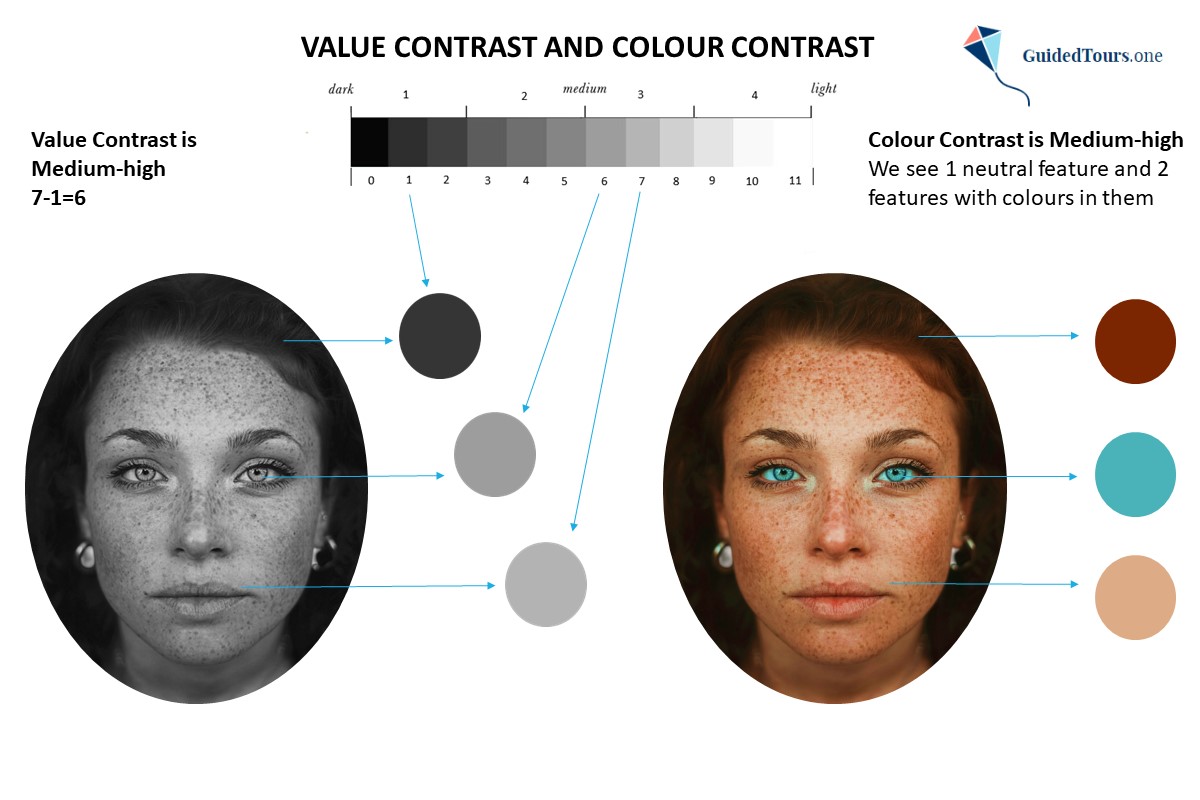
The value (or depth) shows how light or dark a colour is, while the value contrast is the level of difference in value between two or more colours. The closer together colours are, the lower is the level of contrast between them, and the farther apart colours are, the higher is the level of contrast.
On the image on your right, you can see that our Spring season representative has a medium-light skin, medium-dark eyes and dark hair. In order to determine her value contrast level, we converted her photo into greyscale and assigned a value from 0 to 11 to her hair, skin, and eyes (2 to her hair, 8 to her skin, and 3 to her eyes). Next, we took the highest number and took away the lowest number (8-2=6). According to our value contrast scale that you can see below, she has a medium-high value contrast. more
A) 0 - 2 (low value contrast)
B) 3 - 5 (medium-low value contrast)
C) 6 - 8 (medium-high value contrast)
D) 9 - 11 (high value contrast)
The medium-high value contrast, shows us that she can wear colours that provide a medium-high value contrast and her clothes should not be more than 6 values apart.
Based on her value contrast and previous analysis, we can say that she is a Bright (Clear) Spring. Her natural colouring is too deep and too high value contrasting for a Warm (True) Spring. Warm Springs typically have a medium-low value contrast between their features, while Bright Springs have a medium-high or high value contrast.
Colour Contrast
In terms of colour contrast, Bright Springs typically have a medium-low colour contrast, when two of their features are neutral and one feature has a colour in it, or a medium-high colour contrast, when one of their features is neutral, and two features have a colour in them.
On the image on your right, you can see that the Colour Contrast of the same Bright Spring representative is medium-high, as we can see 1 neutral feature and 2 features with colours in them: dark copper hair, green eyes and neutral skin leaning warm. The best colour combination will be: 1 neutral + 2 colours.
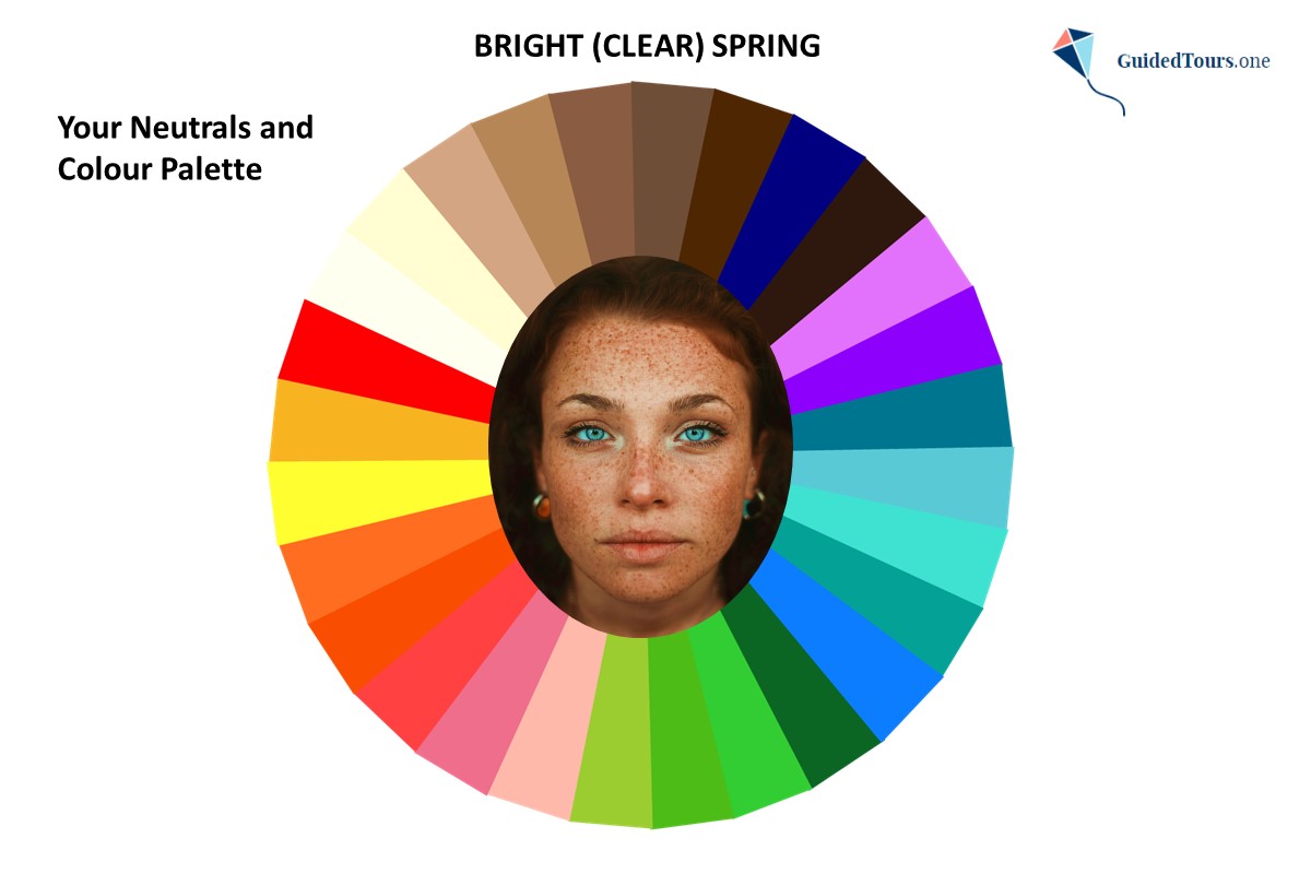

Now, let’s see how the Bright Spring colour palette looks on her (image 1). We can see that the colours are harmonious with her natural colouring, which one more time confirms that she is a Bright Spring.
Just like Bright Spring’s primary colour dimensions, Bright (Clear) Spring colours are bright, warm, and medium-light to be in line with this season type natural colouring.
The overall Bright Spring Colour Palette (image 2) contains some of the most intense and vibrant colours of all the seasons. The colours are mainly medium-light, but there are many colours that are darker, but not extremely dark.
The colours lean slightly towards the warm end of the scale, but they are not extremely warm. The colour palette includes bright pinks, more
purples, greens, yellows, oranges and blues that would overpower any other season.
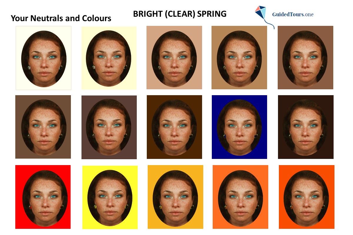
At the same time, there are many neutrals in the Bright Spring palette, including ivory, milk chocolate, navy and espresso. Bright Spring neutrals are highly contrasted including light neutrals, as well as dark ones. This mixture in value is needed to achieve a medium-high value contrast or a high value contrast, as the contrast between this season type features (you will find more details about this in the next section). Black and white are not included in the palette, but Bright Springs have their own “version” of black and white in the palette, most often ivory and espresso.
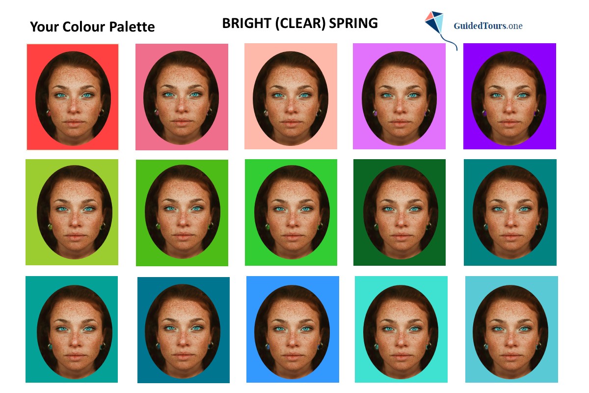
We can also see how well all colours and neutrals from the palette look on her (image 3 and 4).
Bright Spring worst colours are soft and cool, because they are opposed to bright and warm, the main colour aspects of this season type.
At the same time, there are many neutrals in the Bright Spring palette, including ivory, milk chocolate, navy and espresso. Bright Spring neutrals are highly contrasted including light neutrals, as well as dark ones. This mixture in value is needed to achieve a medium-high value contrast or a high value contrast, as the contrast between this season type features (you will find more details about this in the next section). Black and white are not included in the palette, but Bright Springs have their own “version” of black and white in the palette, most often ivory and espresso.
We can also see how well all colours and neutrals from the palette look on her (image 3 and 4).
Bright Spring worst colours are soft and cool, because they are opposed to bright and warm, the main colour aspects of this season type.
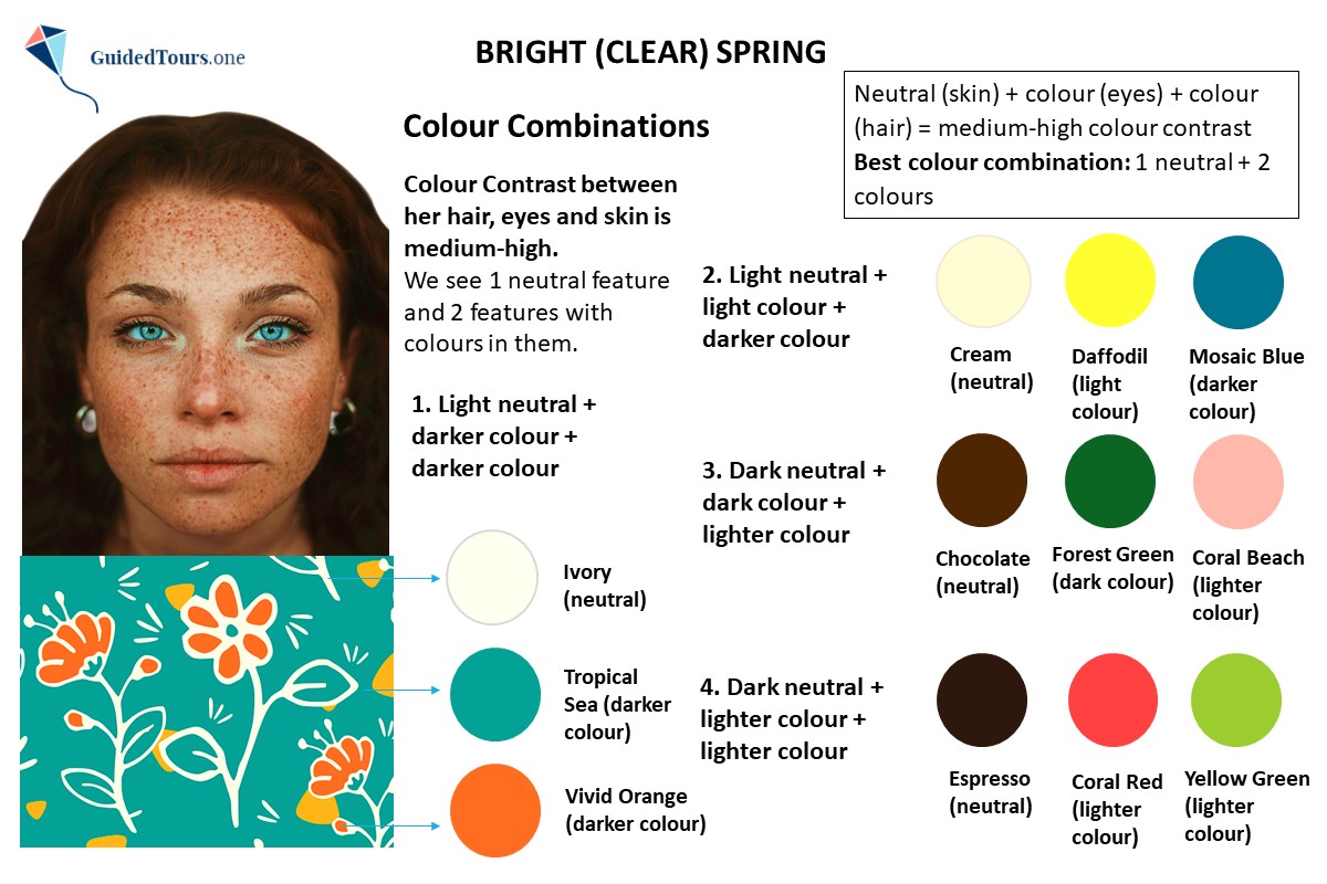
As seen in one of the previous sections, both the value contrast between our Bright (Clear) Spring representative features and the colour contrast are medium-high.
Therefore, this Bright Spring representative can combine colours that provide a medium-high value contrast (taking into consideration the value contrast number), and the best combinations are those that repeat the value contrast level present in the appearance.
In terms of colour, the best colour combination for this Bright Spring with one neutral feature and two features that have a colour in them will be 2 colours and 1 neutral. This colour combination system was created by us and supposes 4 colour combination possibilities based on each season features colour.
As you can see on the image, the best colour combinations for this Bright Spring who has a medium-high colour contrast, more
are the following:
1. A light neutral + a darker colour + a darker colour (1 neutral + 1 colour + 1 colour)
2. A light neutral + a light colour + a darker colour (1 neutral + 1 colour + 1 colour)
3. A dark neutral + a dark colour + a lighter colour (1 neutral + 1 colour + 1 colour)
4. A dark neutral + a lighter colour + a lighter colour (1 neutral + 1 colour + 1 colour)
As our Bright Spring representative has a medium-high value contrast, all colour combinations were chosen to create the same value contrast and they are 6 values apart.
In terms of prints, the best patterns are those that only contain Bright Spring colours, but if you can’t find a print that is completely within your palette, you can opt for a print that also has small colour spots from a disharmonious palette. The best prints for this Bright Spring are those that reflect her medium-high natural contrast level rather than ones which blend too much. The abstract patterns with hand-drawn elements, stylized flowers or fruits, and unique artistic designs are great for Bright Springs. At the same time, geometric patterns with loose arrangement are also fine. The pattern should include bigger elements that are loosely arranged, but not too loose or too dense.
On the image on your right, you can see a pattern with big stylized elements (flowers) which are loosely arranged that contains 1 neutral (ivory) and 2 colours (tropical sea and vivid orange). At the same time, we can also see some spots of yellow colour which is also part of her palette, but they are very small. Besides the appropriate medium-high colour contrast, there is also a medium-high value contrast in this print. If we convert the print into greyscale, we can see that ivory neutral’s value is 10, but tropical sea colour’s value is 4. If we take the highest number (10) and take away the lowest number (4) from this print we get 6 (10-4=6), which is also the natural value contrast number of this Bright Spring representative. As both value and colour contrast are respected, you can notice how harmonious the print looks on this Bright Spring representative.
Step 1: Contact us
Contact us to further purchase your Virtual Colour Analysis: Standard Package (40 €) or Premium Package (100 €).
Step 2: Complete the Colour Questionnaire and take photos
Once you buy your Virtual Colour Analysis, you will receive a Colour Questionnaire by e-mail. Complete the Colour Questionnaire and send it back to us with your photos.
Photos Specifications for Best Results:
- Take minimum 4 or 5 high-resolution (jpeg or png format), more
close-up photos facing the camera (no glasses).
- Do not wear any make-up and send 2 photos with your hair tied back, and 2 with your hair left down. If your hair is colour treated or grey, please also submit a photo with your earlier natural hair colour.
- Wear a white colour top and make sure that your neck is also visible. Your face should fill most of the screen, and only a small piece of your top should be visible.
- Take your photos inside in natural daylight in front of a window on a sunny day, avoid direct sunlight and make sure that there are no shadows on your face. If possible, take them on a white and clear background.
- Make sure that the photos accurately capture your skin tone/undertone and accurately represent your in-person colouring in natural daylight.
- Make sure that your phone's flash is turned off and you have turned off any blurring filters.
- Add 2 close-up photos of one eye to analyse the eye pattern. Make sure that the eye photos are clear and free from glare;
- Add one of your photos at 18-25 years old.
Step 3: Photo Review and Analysis
You will receive a confirmation if your photos are suitable for colour analysis. Once approved, we will get to work on your colour analysis.
Step 4: Receive Your Colour Analysis
You will receive your Seasonal Colour Analysis by e-mail within 3-5 working days. If you didn’t receive it within this period of time, please, also check your spam folder.
Terms and Conditions
1. This is a digital purchase and your Seasonal Colour Analysis will be sent to you as a PDF attachment by e-mail. You understand that no tangible product will be shipped to you.
2. All sales are final and no refunds or exchanges are available after purchase.
3. Your personal information and photos are confidential, being used only for requested services, and deleted after processing. Your final report will include your image(s), which are securely saved in our files.
4. Your questionnaire will be sent to you after purchase. Please, send us a message to us if you didn’t receive it.
5. After sending us the completed questionnaire and required photographs, you will receive by e-mail a confirmation that they are suitable for Colour Analysis.
6. All files contained in your Colour Analysis Report are for personal use and are not allowed to be shared or sold, either in parts or in whole.